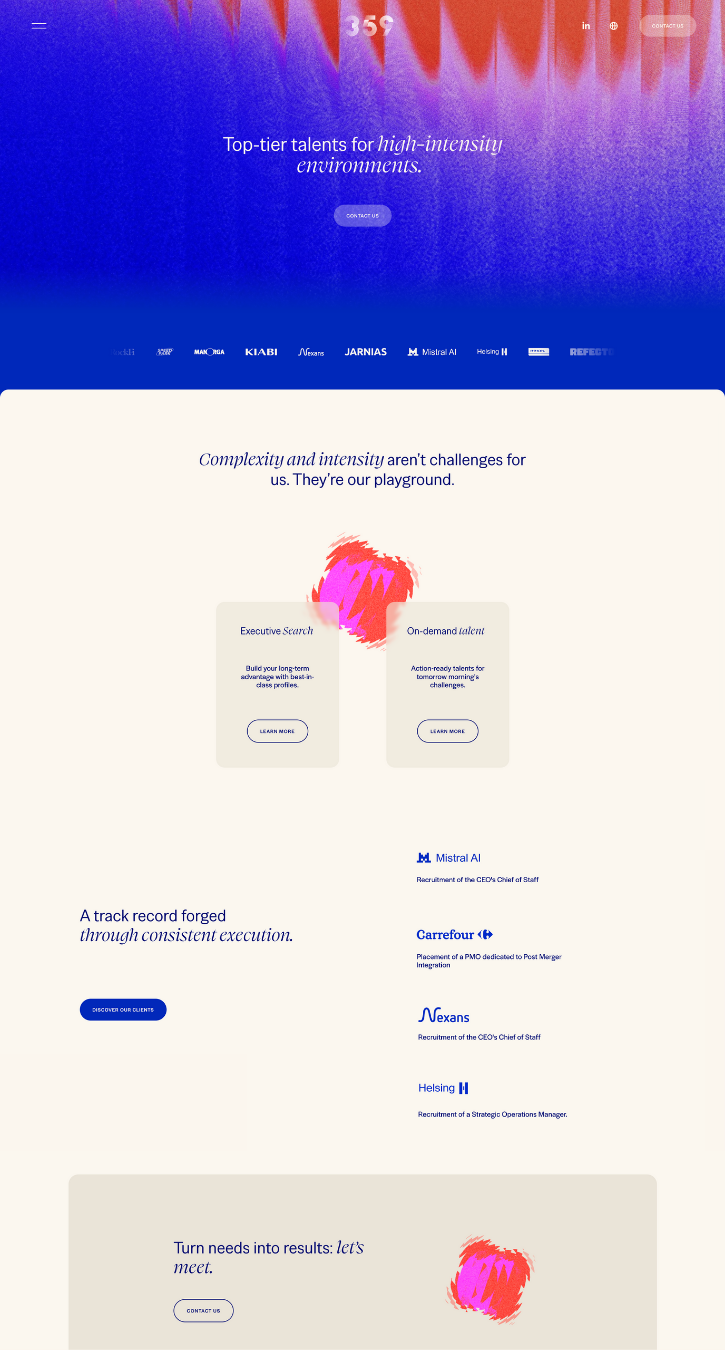
359
By Square Design
St Brieuc, France
This is a refresh from their old existing website. The client was already on Squarespace, but wanted more animations, a new artistic direction, with fresher styles, while keeping an overall professional look.
“We love Squarekicker and what it helps us to achieve on Squarespace websites. The user interface is so simple to use and so well integrated into Squarespace it almost feels native.”
Crux Retail
By Resonant Pixel Company
Atlanta, United States
The brand was on a self-created Wix site using an extremely simple template. The thing is, they create bold retail displays for national brands to sell their goods in major retail stores. After getting to know the team and their ideal client profile, it was clear simple was a poor fit. We set out to create a website that makes a bold statement about their creativity and process. We use the Squarespace gallery block a few times to manage the logo clouds cleanly. Squarekicker customizations made it on to every single page on the site so motion and scale create interactive depth without obscuring important content.
Talland Bay Hotel
By Altitude
Plymouth, United Kingdom
A charming coastal hotel doesn't have to choose between personality and functionality. Altitude created a whimsical digital experience for Talland Bay Hotel that brings their adventurous spirit to life.
The solution? A playful, engaging platform powered by SquareKicker's animation tools. We leveraged scrolling effects, mouse cursor customization, desktop overlay menu, and general styling to create a seamless journey through the hotel experience, highlighting the unique character and welcoming warmth of this Cornish icon.
By combining Squarespace's intuitive platform with SquareKicker's advanced design capabilities, we created a digital adventure that's as engaging and memorable as the hotel itself — proving that personality online converts guests in real life.
Colour Brave
By Tom Kidd
Lancaster, United Kingdom
Colour Brave — a name that says it all. This interior designer needed a portfolio that would stop potential clients mid-scroll and showcase her fearless approach to design.
The solution? A vibrant, engaging platform powered by SquareKicker's animation tools. We leveraged smooth scroll effects, hover animations, and dynamic transitions to create a seamless journey through her work, highlighting the thoughtful details and creative vision behind each project.
By combining Squarespace's intuitive platform with SquareKicker's advanced design capabilities, we created a digital shop window that's as bold and unique as the interiors it showcases — proving that being colour brave online pays off.
Lundi CoWorking
By Better Stronger Studio
“Lundi” means Monday in French — the most dreaded day of the week for many. The client’s ambition was bold: create a coworking space that flips that narrative and makes people look forward to the start of the week.
They wanted a website that felt as dynamic and unconventional as their space — a place that’s free, vibrant, agile, and joyfully chaotic. We embraced this vision with an explosive color palette and a mix of geometric shapes to reflect diversity and movement.
By combining Squarespace’s native strengths with SquareKicker’s creative power, we built something bold, human, and engaging — just like the co-working space it represents.
Some Shape Studio
By Some Shape Studio
Wellington, New Zealand
We rebuilt the Some Shape Studio website from the ground up to better reflect our brand—bold, considered, and quietly confident. We wanted the site to feel as intentional and crafted as the work we deliver, with subtle animation, clear structure, and an intuitive user journey. Built entirely from scratch on Squarespace, we focused on creating a site that prioritised clarity, storytelling, and detail—balancing visual design with functional flow. The result is a site that feels like us: calm, creative, and confident in the details.
“SquareKicker has been pivotal in our growth over the past 12 months. It’s enabled us to deliver custom animations and advanced styling to clients without the cost of custom code, significantly reducing production time and elevating the professionalism of our work. It's a game-changer for no-code design on Squarespace.”
The GRITS Collective
By The GRITS Collective
GRITS is a boutique Creative Studio + Art Collective specializing in editorial photo, film, & storytelling content for social media and beyond. We are culturally-driven visual narrators and creative partners serving the boldest leaders in lifestyle and fashion.GRITS emerged from a passion to fill the gap in representation within the commercial and film industries. Made of a collective of artist friends in Richmond, our studio exists to amplify underrepresented stories and offer a platform for our talent to thrive, unapologetically centring community over clientele.
“Squarekicker has allowed us to take our agency's site to the next level and showcase our work in a unqiue way as a creative business.”
Aini Maensivu
By Taru Salokangas
Finland
This project is a re-design of the client's old website. She wanted to focus more on her personal brand instead of only company branding and services. We used the existing color scheme, but otherwise gave the website a completely new look and feel. The new design combines easy-going brand photos with snapshot images taken with her phone from all her travels to emphasize the digital nomad lifestyle she is advocating for.
"I have studied web design already way back before platforms like Squarespace even existed. So some light CSS coding comes fairly easily to me and it hasn't been a problem tweaking Squarespace sites. But when I found Squarekicker, I was blown away. Using it has truly made a huge difference to how quickly I can create the designs I have in mind. I couldn't live without it anymore."
Walrus
By Square Design
Web design and branding studio, Square Design specializes in the creation of premium websites. Squarespace and Shopify experts, we support our clients from the creation or redesign of their visual identity to the creation of their showcase or e-commerce site.
”With the help of SquareKicker, on this website we have been able to create a design with thin lines which created an architectural look. SquareKicker has enabled us to display the lines from edge to edge of each section, which was very handy!”
Braid Road
By BRAID ROAD
This inspiration site is a clean, bold, visually striking single page site using SquareKicker scrolling effects and sticky sections to keep visitors engaged as they move through the page.
BRAID ROAD is a boutique branding and design studio that specialise in modern brand identities and thoughtful communication design. They help small to medium sized businesses capture their target markets attention, grow brand recognition and achieve their financial goals.
”It (SquareKicker) has enabled us to design and produce websites for our clients that are much more impactful visually and a lot more intuitive to use. And it allows us to offer website production services that set our clients apart from their competition.”
the little red sofa
By the little red sofa
the little red sofa is a strategic brand design studio. They offer brand therapy sofa sessions to help clients solve strategic problems.
They are especially interested in brands that give back what they take out – those that take environmental and sustainable concerns seriously and embed them into their business practices.
“Squarespace is a great platform; however, I needed an interactive boost to help my company stand out from the rest. The trick is when you have alot of written content - Using horizontal scrolling really helped with this to help keep the user engaged throughout.” - the little red sofa
Thoughtful Web
By Thoughtful Web
Thoughtful Squarespace websites for conscious solopreneurs and small businesses based in Melbourne, Australia.
“SquareKicker has given my site an extra design flare and enabled a premium, creative online experience. Can't wait to use it on a client site next week. I can already see how it will elevate their brand.” - Bec
Visit Website
Studio Designah
By Studio Designah
Studio Designah is a branding and web studio that focuses on giving small cafes and bakeries a distinct branding for them to shine, to be seen, and to grow bigger. We say nah to the ordinary.
“Using SquareKicker has instantly given my site a face lift with no code knowledge. It makes it much more interesting to my visitors and widen my boundaries on my website design.” Christiana, Studio Designah
Sophinka Design
By Sophie Hartl
I'm a freelance graphic designer specializing in branding and the creative elements that bring them to life. My style tends to be nostalgic, dreamy, bright, playful, and clean.
I was able to still use Squarespace (which I love) but bring my website to the next level with fun little quirks and touches that were possible with SquareKicker! It was so easy to use and also lots of fun to explore all of the feature SquareKicker has.
Slice of the Union
By Jordan Mills
The 2023 Slice of the Union Address. Celebrate National Pizza Day with our annual retrospective of how America ate the best thing to eat: PIZZA.
Slice's mission is to keep local thriving. By empowering independent pizzerias with the tech and services that power the big chains, we enable them to be in business for themselves, not by themselves.
“By utilizing Squarekicker, our marketing team has been able to inject more creativity and flair into our campaign landing pages, resulting in greater support and engagement from our target audience.”
The FAB Squad
By The FAB Squad
The FAB Squad is a PERSONAL BRANDING AGENCY - a ONE-STOP-SHOP for your VISUAL PERSONAL BRAND.
We are the Bucharest-based creative studio where our love for people, art, photography, graphic design, and make-up come together with a friendly, fun, and easygoing atmosphere and create the perfect place where you can find your inner FAB. To us, being FAB is about feeling good, loving your true YOU, about being comfortable and loving life, creating beauty and supporting great causes at all times. Your attitude is your most important asset.
Our mission at The FAB Squad is to define your visual brand and to make you feel amazing and proud of it!
This website is a canvas to show off everything we're good at and soon to be a learning platform.
Panoply
By SquareKicker
This site was designed in house by the SquareKicker’s fabulous designer Loren.
Showcasing sticky blocks and sticky sections this site shows an interesting alternative for portfolio design.
Santoro
By Christopher Santoro
We're a New England-born design studio with locations in Boston, MA and Providence, RI. Since 2012, we've engaged with a wide variety of clients—from small businesses to e-commerce brands; from tech & healthcare to CPG.
Our previous website was built on WordPress and took a lot of time to update and bug-fix. With our new rebrand, we wanted to completely rethink our website and how we were using it. We concluded that, aside from reflecting the new brand identity, we wanted the site to be faster to update from a page-building standpoint—especially for case studies and landing pages. We've had history using Squarespace in the past, but even with Layout Engine we weren't sold on the ability to further customize outside of their pre-set blocks. Discovering SquareKicker was ultimately what brought us back.
Dress Code
By SquareKicker
This site was built as a showcase for the SquareKicker Sticky features. It utilizes SquareKicker Sticky Blocks to capture the viewers attention and draw their attention to specific items as the page is scrolled.
Check out the tutorial to see how to add Sticky Block features to your next Squarespace build.
Mouse Cursors
By SquareKicker
This page was built out as an example of the new SquareKicker Mouse Cursor tool. Check out the tutorial to add some of these concepts to your next build.


