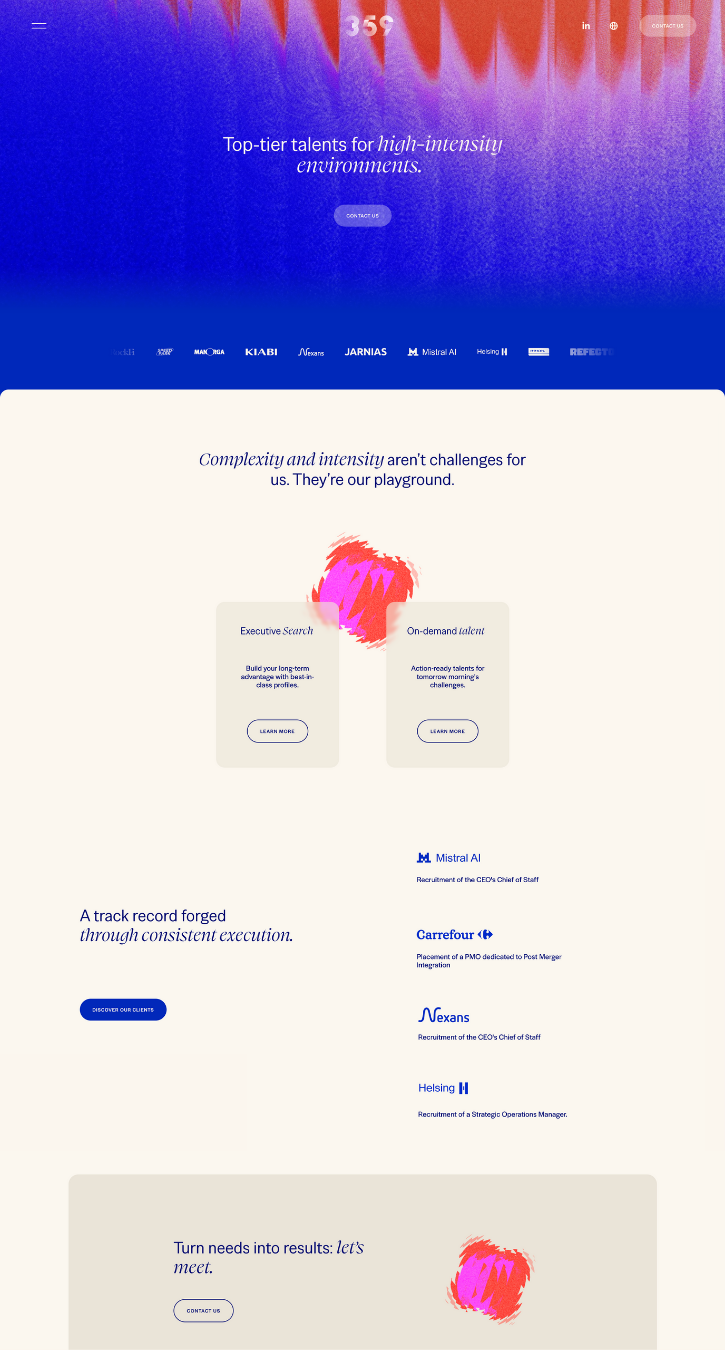
359
By Square Design
St Brieuc, France
This is a refresh from their old existing website. The client was already on Squarespace, but wanted more animations, a new artistic direction, with fresher styles, while keeping an overall professional look.
“We love Squarekicker and what it helps us to achieve on Squarespace websites. The user interface is so simple to use and so well integrated into Squarespace it almost feels native.”
The GRITS Collective
By The GRITS Collective
GRITS is a boutique Creative Studio + Art Collective specializing in editorial photo, film, & storytelling content for social media and beyond. We are culturally-driven visual narrators and creative partners serving the boldest leaders in lifestyle and fashion.GRITS emerged from a passion to fill the gap in representation within the commercial and film industries. Made of a collective of artist friends in Richmond, our studio exists to amplify underrepresented stories and offer a platform for our talent to thrive, unapologetically centring community over clientele.
“Squarekicker has allowed us to take our agency's site to the next level and showcase our work in a unqiue way as a creative business.”
Qazi Asif
By Qazi Asif
This striking website uses scrolling effects to draw the viewer through each page. With bold typography and a black and white color palette, this website is sure to inspire you.
”SquareKicker was an invaluable tool that boosted my confidence. It helped me craft a compelling narrative about my work, guiding my creative direction. This not only attracted clients but also showcased the effectiveness of Squarespace with SquareKicker.”
Design CEO
By DesignCEO
This bold website showcases a leadership business, coaching, team building and speaking.
”I am not a designer, but I love the challenge of building things. So much of my energy comes from this. I wanted the website to represent a very specific offering, as well as a clear brand, and I wanted to build it myself. I tested other platforms, but when I happened across SquareKicker, everything changed. I have fully embraced it. There is not one part of the website that has not been SquareKickered. It is a remarkable, highly useable tool, perfectly suited for people such as me, when ambition fully outweighed capability. It bridged that gap, and all now seemed possible. It is a ripper.”
Loren Pasquier
By Loren Pasquier
“I can barely write a line of code. I feel like I am the living proof that, thanks to SquareKicker, all you need to be a great web designer is a good eye and a sense of aesthetic.
This portfolio site captures snippets of my work outside of being SquareKicker’s brand designer. I found making my own website to be the hardest exercise! In the end, I thought simple is best. So here it is!”
September
By September Design Studio
With a strong background in the arts, September Design Studio aims to serve the style-conscious entrepreneur by delivering meaningful, quality work that not only elevates their brand, but increases their conversions.
”Creating a website with the kinds of functionalities through manual coding used to be a huge undertaking. Integrating SquareKicker with the new Squarespace fluid engine made it incredibly simple and efficient for me to provide a custom product for my clients and truly impress them. I am able to provide more even more value in less time. The SquareKicker subscription is money extremely well spent for any Squarespace designer.” - September Design Studio
Thoughtful Web
By Thoughtful Web
Thoughtful Squarespace websites for conscious solopreneurs and small businesses based in Melbourne, Australia.
“SquareKicker has given my site an extra design flare and enabled a premium, creative online experience. Can't wait to use it on a client site next week. I can already see how it will elevate their brand.” - Bec
Visit Website
FMC
By Design Powers
Once the writing, photography, and design were approved we built a polished, easy-to-navigate professional website that clearly explains FMC’s services, shows off their portfolio of multi-million dollar projects, and highlights their expert team. It also builds their online authority through organic content creation on the news page (blog), and connects with their clients and colleagues through email marketing campaigns.
The website is simple to use and manage, complete with on-and-off page SEO, legal pages, basic accessibility, and analytics tools. We also train our clients on how to use and manage the website AND set up the scheduling features to help them streamline and manage their appointments, availability and calendar.
Sunnies
By SquareKicker
This site was designed in house by the SquareKicker’s fabulous designer Loren.
Showcasing sticky sections, sticky split and a touch of scrolling effects, this site offers a beautiful way to showcase your new product collection.
Sarah Guren
By Golnar Parry Designs
Golnar is a logo, branding and Squarespace website designer based in Cleveland, Ohio, USA, who loves being both designer and educator. The process of discovery that happens when capturing the essence of a business is what she enjoys the most in working with small businesses, non-profits and creatives.
This client needed a website refresh with a focus on her new venture into fiber arts. Additional needs included her previous portfolios of work as a photographer, a new online shop to sell her products, and helping her distill the story of her family's explorations into sustainable/closed loop living practices on their property, Base Camp Farm. We also set up a blog page for her next phase of growth, plus a newsletter block to help her start growing a community of interested followers.
Panoply
By SquareKicker
This site was designed in house by the SquareKicker’s fabulous designer Loren.
Showcasing sticky blocks and sticky sections this site shows an interesting alternative for portfolio design.
Mantaray
By The FAB Squad
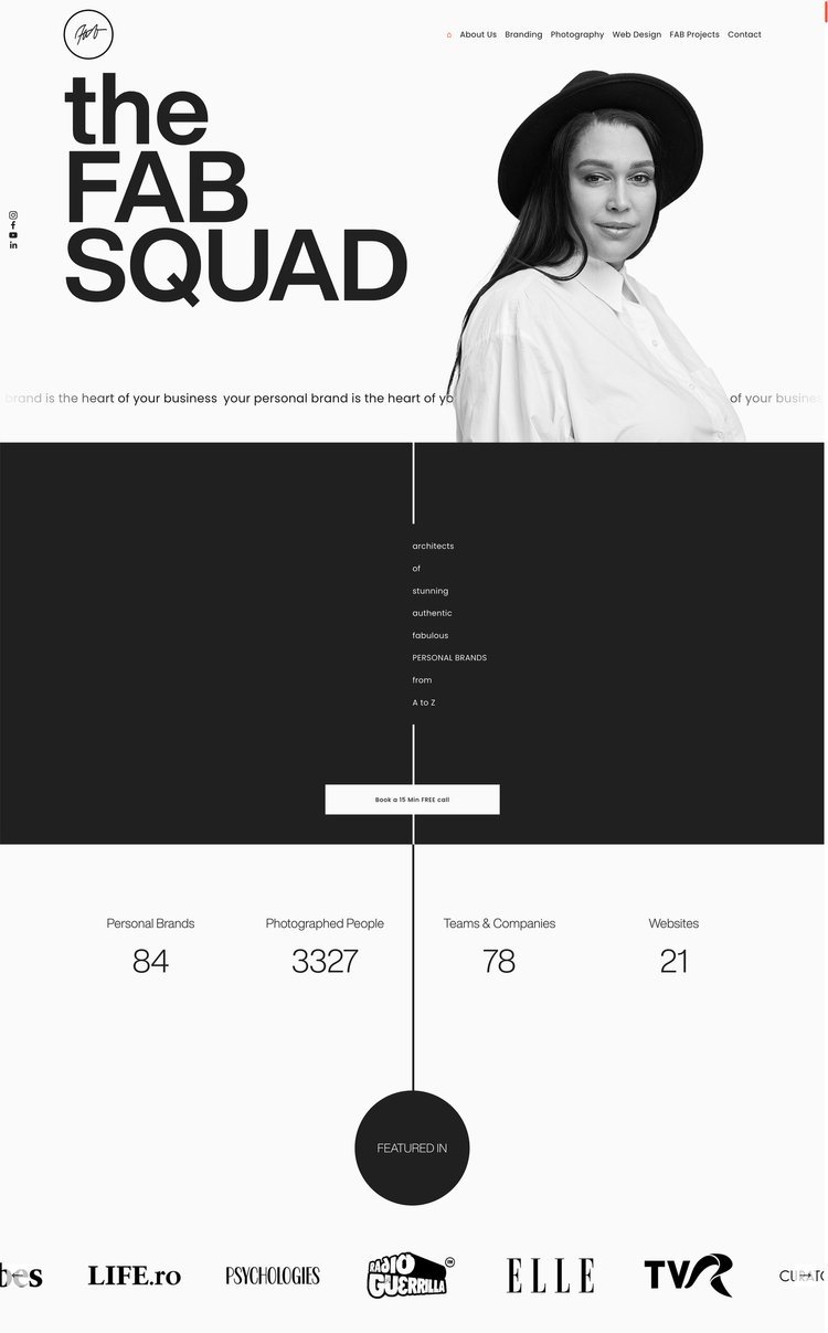
The FAB Squad is a PERSONAL BRANDING AGENCY - a ONE-STOP-SHOP for your VISUAL PERSONAL BRAND.
“We are the Bucharest-based creative studio where our love for people, art, photography, graphic design, and make-up come together with a friendly, fun, and easygoing atmosphere and create the perfect place where you can find your inner FAB. To us, being FAB is about feeling good, loving your true YOU, about being comfortable and loving life, creating beauty and supporting great causes at all times. Your attitude is your most important asset.
Our mission at The FAB Squad is to define your visual brand and to make you feel amazing and proud of it!”
For this site the client requested a simple portfolio website for their architecture studio. Home Page + Portfolio.
Visit Website
Santoro
By Christopher Santoro
We're a New England-born design studio with locations in Boston, MA and Providence, RI. Since 2012, we've engaged with a wide variety of clients—from small businesses to e-commerce brands; from tech & healthcare to CPG.
Our previous website was built on WordPress and took a lot of time to update and bug-fix. With our new rebrand, we wanted to completely rethink our website and how we were using it. We concluded that, aside from reflecting the new brand identity, we wanted the site to be faster to update from a page-building standpoint—especially for case studies and landing pages. We've had history using Squarespace in the past, but even with Layout Engine we weren't sold on the ability to further customize outside of their pre-set blocks. Discovering SquareKicker was ultimately what brought us back.
isimplydesign
By isimplydesign
It was my own website for a website design business, where I could offer my design packages and showcase my portfolio. I wanted also to tell my story and inform potential customers about the services that I offer.
Marito
By HOFMARSCHALL and CATENAZZI GRAFIK+PRODUKTE
This was a rebuild of en existing site to provide a fresh modern update for the brand.
A clean bold site the designer has used sharp black and whites with fresh green highlights.
Non-for-profit Page
By SquareKicker
The inspiration for this site came from a Climate focused non-profit. This example website showcases scroll effects on text blocks and, horizontal scroll with a fixed background and some exciting use of Squarespace’s new shape blocks combined with SquareKicker Sticky Block tool.
Visit website
Grown Girl Divorce
By Launch the Damn Thing!™️
The client wanted an education resource hub that could scale with her, as she has a small blog and podcast now but wants to add a membership and a shop in the future after growing her audience.
I reorganized all of her resources/information, and set up her separate podcast blog collection to share new episodes with its own post features. I also installed many custom features to allow her to advertise or place call-to-actions at the bottom of her posts and to allow users to sort through her content easily. I modernized her previous DIY design and elevated the design style to reach her preferred target audience more strategically.
I had an absolute blast working with this client and we had almost no revisions to the initial draft. She's a kickbutt lady and I loved working with her!
100 Days of Brave
By Hatch Labs
My client was launching a book that helps readers launch their business in 100 days. The brief was to build something colourful and easy to navigate with plenty of movement. With a strong brand and amazing photography ready to work with, the site was incredibly fun to build. SquareKicker's features helped add movement which brought the site to life.
The FAB Squad
By The FAB Squad
The client wanted a one-page website showcasing her business coaching programs.
SquareKicker Sticky Split and Sticky Section has been used masterfully throughout, guiding the visitor through each section of this engaging site.


