Sinziana Ionescu
By The FAB Squad
Sinziana (the client) wanted an easy to read, mobile friendly coaching site. She's a certified Life Coach focusing on helping women seeing more possibilities in their romantic partnerships. The project will span 12 months and we started with an MVP comprising of a HomePage, an About Me page and a Services Page. The next steps will be to add a Blog and several Member Areas.
isimplydesign
By isimplydesign
It was my own website for a website design business, where I could offer my design packages and showcase my portfolio. I wanted also to tell my story and inform potential customers about the services that I offer.
Dalvey & Co
By Vative Creative
The client already had a website up for their small business. The scope oif the business started to grow and they wanted their website to match the growing business. I completely overhauled the website.
Incorporating and emphasize of scrolling and engaging customers by perfect matching the product with incredible design
Marito
By HOFMARSCHALL and CATENAZZI GRAFIK+PRODUKTE
This was a rebuild of en existing site to provide a fresh modern update for the brand.
A clean bold site the designer has used sharp black and whites with fresh green highlights.
Non-for-profit Page
By SquareKicker
The inspiration for this site came from a Climate focused non-profit. This example website showcases scroll effects on text blocks and, horizontal scroll with a fixed background and some exciting use of Squarespace’s new shape blocks combined with SquareKicker Sticky Block tool.
Visit website
Grown Girl Divorce
By Launch the Damn Thing!™️
The client wanted an education resource hub that could scale with her, as she has a small blog and podcast now but wants to add a membership and a shop in the future after growing her audience.
I reorganized all of her resources/information, and set up her separate podcast blog collection to share new episodes with its own post features. I also installed many custom features to allow her to advertise or place call-to-actions at the bottom of her posts and to allow users to sort through her content easily. I modernized her previous DIY design and elevated the design style to reach her preferred target audience more strategically.
I had an absolute blast working with this client and we had almost no revisions to the initial draft. She's a kickbutt lady and I loved working with her!
Block Counseling pws
By Charity Mahone Digital Design Co
My client built her website herself when she first started her private practice. She was getting traffic but struggled with conversion. The brief consisted of creating a new modern site with movement, better user experience, and great imagery to attract her ideal clients. Squarekicker helped me bring this project to life.
Oome
By Quarles Studio
Introducing oome! The best smoked tofu in the game. Perfect for families on the go. For launch, we went with a single page site that showcases quick facts about the brand, product, and where to purchase.
Elegant Online Store on Squarespace
By SquareKicker
This e-commerce website shows off subtle scrolling effects and a striking horizontal scroll. The product thumbnails are maximised using hover effects to display multiple images of each item.
Visit website
100 Days of Brave
By Hatch Labs
My client was launching a book that helps readers launch their business in 100 days. The brief was to build something colourful and easy to navigate with plenty of movement. With a strong brand and amazing photography ready to work with, the site was incredibly fun to build. SquareKicker's features helped add movement which brought the site to life.
Wedding Photographer Portfolio on Squarespace
By SquareKicker
This elegant Wedding Photography website uses vertical lines to draw the visitors eye down the site. Hover effects in the first section adds a unique menu option with a linkable word appearing on hover. Scrolling effects throughout the site keeps the user focused on the key elements in your page.
Krishna Solanki Designs
By Krishna Solanki Designs
This specific build is for my own agency website, I wanted to add a little interest but nothing to over the top as simplicity was key. I've included angled section dividers, horizontal scrolling, adding section width layouts amends, side-scrolling effects! And I have plans to add a few new features in the next couple of weeks too, like form customisation! Can not wait!
The FAB Squad
By The FAB Squad
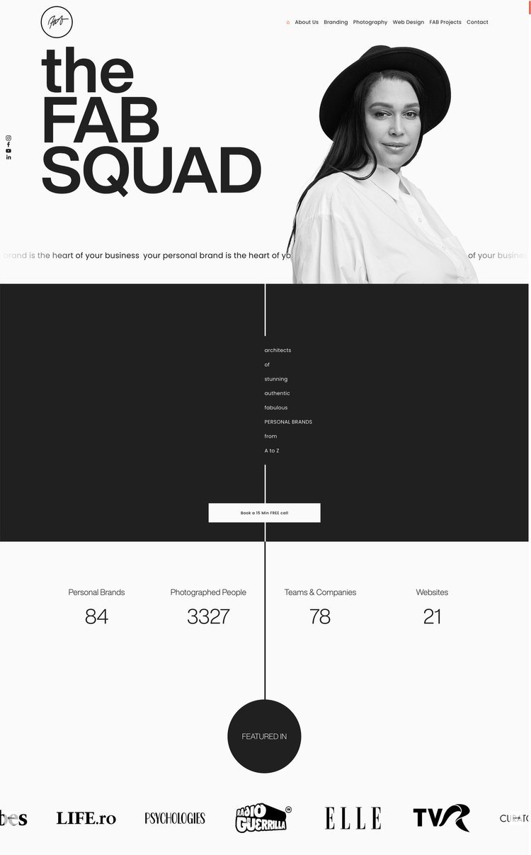
The client wanted a one-page website showcasing her business coaching programs.
SquareKicker Sticky Split and Sticky Section has been used masterfully throughout, guiding the visitor through each section of this engaging site.
Concrete
By Concrete
The client has created a cork product for playgrounds, instead of using other products that are not great for the environment.
Concrete completed brand and website design and development implementing natural colors and clean text effectively highlighting the site imagery. Built originally in Squarespace Classic, some pages were updated to Fluid Engine.
Visit website
Architecture Studio Portfolio on Squarespace
By SquareKicker
This Architecture portfolio shows the best of SquareKicker’s Horizontal Scroll and Scrolling Effects leading the visitor on a journey through the content with each new scrolling element grabbing their attention and refocusing them on the content.
Visit website
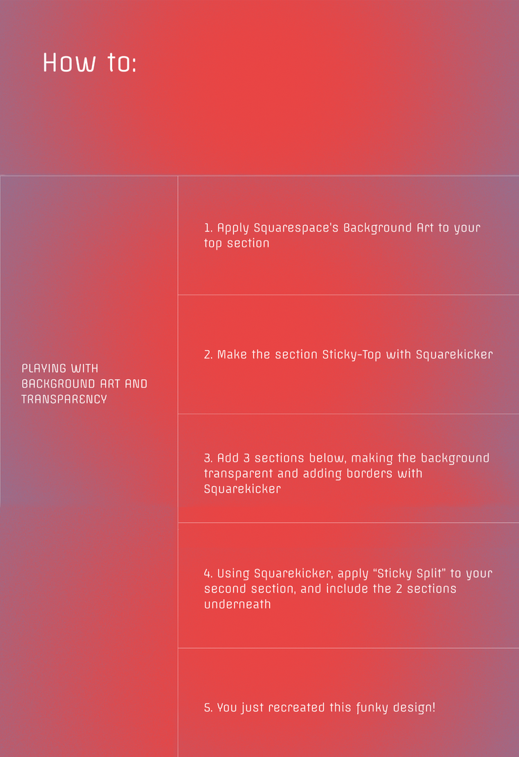
Background Art and Transparency on Squarespace
By SquareKicker
Combining Squarespace Background Art and transparent sections with SquareKicker Sticky Sections this website creates a mesmerising background to display your content.
Sticky Sections on Squarespace
By SquareKicker
Showcasing the best of Sticky Sections this page is sure to inspire you to add some artistic touches to your website.
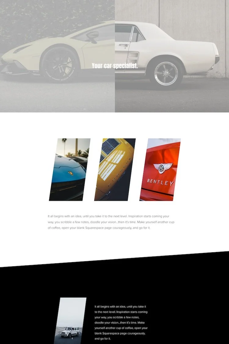
Custom Section Dividers on Squarespace
By SquareKicker
Filled with SquareKicker Hover Effects you will want to spend a while finding all the tantalising surprises in this site. The small business design also uses the ever popular Section Dividers and Scrolling Effects.
Dr Hixson
By Muffy J. Davis Design
I design websites for creative geniuses, nature babes, weirdos, artists, visionaries and other small business owners. My client wanted a site that engaged the client with bright pops of color, movement, and shapes.


