Vespr
By Vespr
Vespr is a creative production studio. We offer full turnkey creative solutions for businesses. Everything including photo, video, design and audio production.
We pride ourselves on being a one-stop agency for brands and businesses.
”Bounce rate on websites can be quite high and working in a fairly oversaturated market, I wanted to stand out from the crowd. Manually coding a website that showcases these sort of features is a huge undertaking. Pairing SquarKicker with the new Squarespace fluid engine allowed me to bring my ideas to life extremely easily and efficiently.”
FMC
By Design Powers
Once the writing, photography, and design were approved we built a polished, easy-to-navigate professional website that clearly explains FMC’s services, shows off their portfolio of multi-million dollar projects, and highlights their expert team. It also builds their online authority through organic content creation on the news page (blog), and connects with their clients and colleagues through email marketing campaigns.
The website is simple to use and manage, complete with on-and-off page SEO, legal pages, basic accessibility, and analytics tools. We also train our clients on how to use and manage the website AND set up the scheduling features to help them streamline and manage their appointments, availability and calendar.
Sunnies
By SquareKicker
This site was designed in house by the SquareKicker’s fabulous designer Loren.
Showcasing sticky sections, sticky split and a touch of scrolling effects, this site offers a beautiful way to showcase your new product collection.
Klivfit
By Dreyah Bohlen Designs
Dreyah, is a part of the Nerdville team! Building websites in all industry’s and providing a full service with marketing content creation.
For this build the client wanted to update their 7.0 site and give it a more feminine, elegant look!
The FAB Squad
By The FAB Squad
The FAB Squad is a PERSONAL BRANDING AGENCY - a ONE-STOP-SHOP for your VISUAL PERSONAL BRAND.
We are the Bucharest-based creative studio where our love for people, art, photography, graphic design, and make-up come together with a friendly, fun, and easygoing atmosphere and create the perfect place where you can find your inner FAB. To us, being FAB is about feeling good, loving your true YOU, about being comfortable and loving life, creating beauty and supporting great causes at all times. Your attitude is your most important asset.
Our mission at The FAB Squad is to define your visual brand and to make you feel amazing and proud of it!
This website is a canvas to show off everything we're good at and soon to be a learning platform.
The John Huntington
By Golnar Parry Designs
After decades of quietly supporting the college and vocational training of thousands of young Clevelanders from behind the scenes without the need for any forward facing visual identity, this longtime, established foundation now wanted to connect with their scholars and alums. To this end, they needed the full development of a logo, branding elements and website that could convey the legacy of their giving, the story of the fund past and present, while also highlighting the stories of the young people they serve.
Golnar is a logo, branding and Squarespace website designer based in Ohio. Golnar has also helped many clients go from feeling tech-overwhelm to feeling like "THIS IS ACTUALLY DOABLE!" with step-by-step guidance - and, of course, the ease of the Squarespace platform.
Sarah Guren
By Golnar Parry Designs
Golnar is a logo, branding and Squarespace website designer based in Cleveland, Ohio, USA, who loves being both designer and educator. The process of discovery that happens when capturing the essence of a business is what she enjoys the most in working with small businesses, non-profits and creatives.
This client needed a website refresh with a focus on her new venture into fiber arts. Additional needs included her previous portfolios of work as a photographer, a new online shop to sell her products, and helping her distill the story of her family's explorations into sustainable/closed loop living practices on their property, Base Camp Farm. We also set up a blog page for her next phase of growth, plus a newsletter block to help her start growing a community of interested followers.
Diana Lupu
By The FAB Squad
The client is a psihoterapeut (psychotherapist) and needed an online home to better present her work.
This site features a clean aesthetic using a creative home page with horizontal slider, mobile style menu and sticky sections.
Nocturn
By NOCTURN Designs
NOCTURN shines a light on later life dancers with an invitation to co-create interactive digital dance adventures.
SquareKicker allowed us to include a sense of flow into the user experience which is important for us as a dance company.
New Gen
By CivicWorks
CivicWorks is a design forward and outcome driven urban planning and design consultancy based in Calgary, Canada.
For this website the client asked for a fresh, modern design for his site, making it stand out from the rest.
Panoply
By SquareKicker
This site was designed in house by the SquareKicker’s fabulous designer Loren.
Showcasing sticky blocks and sticky sections this site shows an interesting alternative for portfolio design.
Mantaray
By The FAB Squad
The FAB Squad is a PERSONAL BRANDING AGENCY - a ONE-STOP-SHOP for your VISUAL PERSONAL BRAND.
“We are the Bucharest-based creative studio where our love for people, art, photography, graphic design, and make-up come together with a friendly, fun, and easygoing atmosphere and create the perfect place where you can find your inner FAB. To us, being FAB is about feeling good, loving your true YOU, about being comfortable and loving life, creating beauty and supporting great causes at all times. Your attitude is your most important asset.
Our mission at The FAB Squad is to define your visual brand and to make you feel amazing and proud of it!”
For this site the client requested a simple portfolio website for their architecture studio. Home Page + Portfolio.
Visit Website
Santoro
By Christopher Santoro
We're a New England-born design studio with locations in Boston, MA and Providence, RI. Since 2012, we've engaged with a wide variety of clients—from small businesses to e-commerce brands; from tech & healthcare to CPG.
Our previous website was built on WordPress and took a lot of time to update and bug-fix. With our new rebrand, we wanted to completely rethink our website and how we were using it. We concluded that, aside from reflecting the new brand identity, we wanted the site to be faster to update from a page-building standpoint—especially for case studies and landing pages. We've had history using Squarespace in the past, but even with Layout Engine we weren't sold on the ability to further customize outside of their pre-set blocks. Discovering SquareKicker was ultimately what brought us back.
Rockets
By Tobi Lukaschek
Rocket’s is an Irish-owned restaurant franchise business with a network of 7 restaurants operating in Ireland and Germany across the formats of Eat-in, Home Deliveries/online orders, Collections & Self-Order Kiosks.
We were looking to create a simple yet clever restaurant website. SquareSpace + SquareKicker simply our lives!
* Click on the Food&Drink page to see an amazing Sticky Split Menu
Joel Porter
By Joel Porter
Being the client, I wanted to create a unique hub and platform for everything I create as an artist/musician. I love Squarespace, and think they are ahead when it comes to design, ease of use, etc, but for my upcoming album release, I wanted to create a new experience for people who found their way to my website. I wanted it to be simple to navigate and provide an experience that felt more interactive than your standard artist page.
Enter Horizontal Scroll. Once I found out that this was a design option, my entire site was built around the tool... which created certain challenges and parameters... but more importantly, it brought a different way of thinking and a whole string of new design possibilities to the table.
SquareKicker has allowed me to focus on design, and make tangible ideas that are in my head that were once locked behind the walls of code!
Original Box
By Original Box
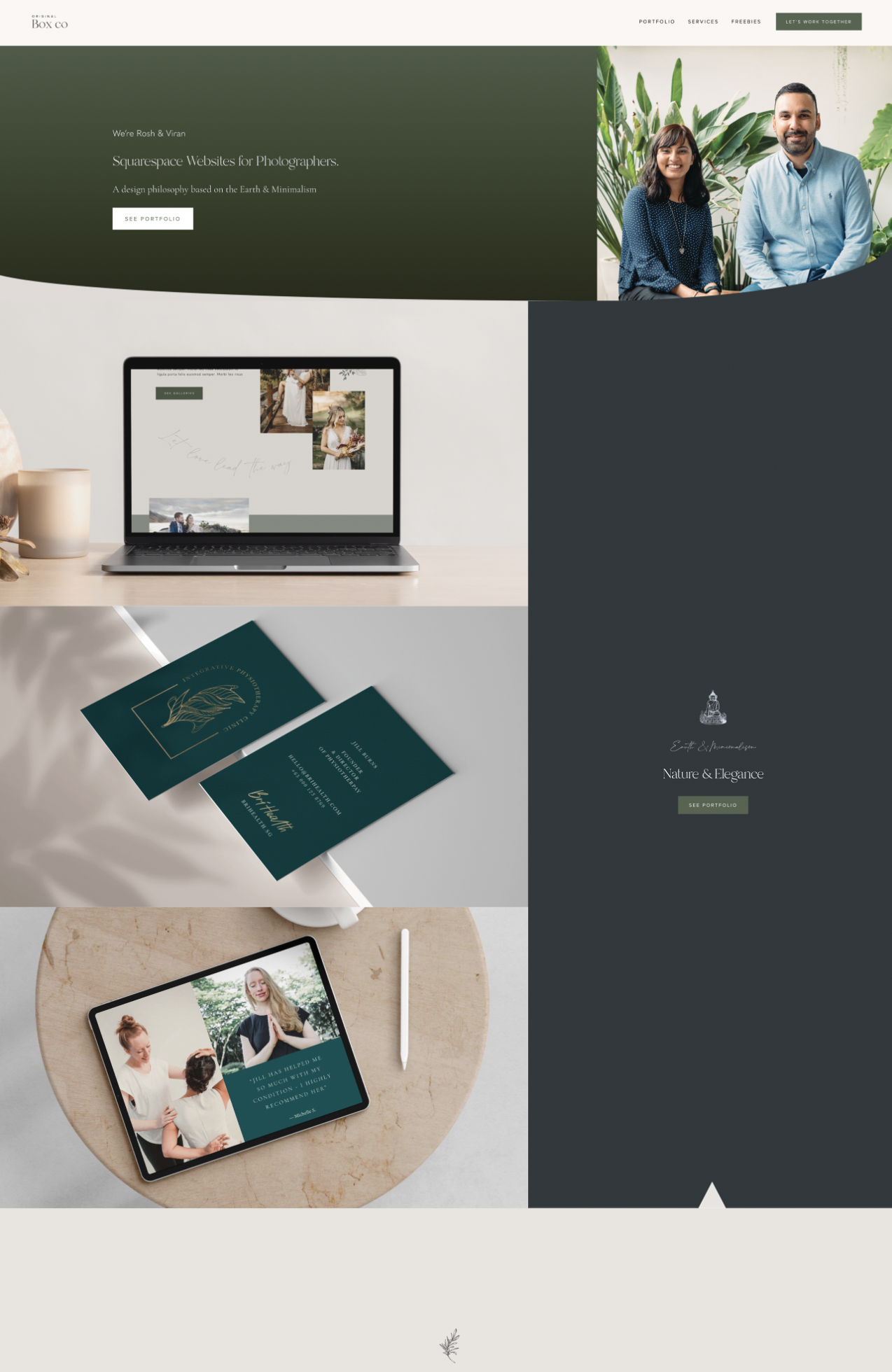
This is our own website, which we have recently re-designed using SquareKicker. The main purpose of the re-design was to have something more unique, something different, more aligned with our purpose and, to utilise the most updated Squarespace features (as until then we were only using version 7.0).
Our new site allows us to showcase testimonials in a more exciting way, as well as our portfolio. We've continued to use Squarespace's own features, as well as SquareKicker to enhance the overall look! This project was so exciting to complete!
Alphaleads
By AlphaLeads BV
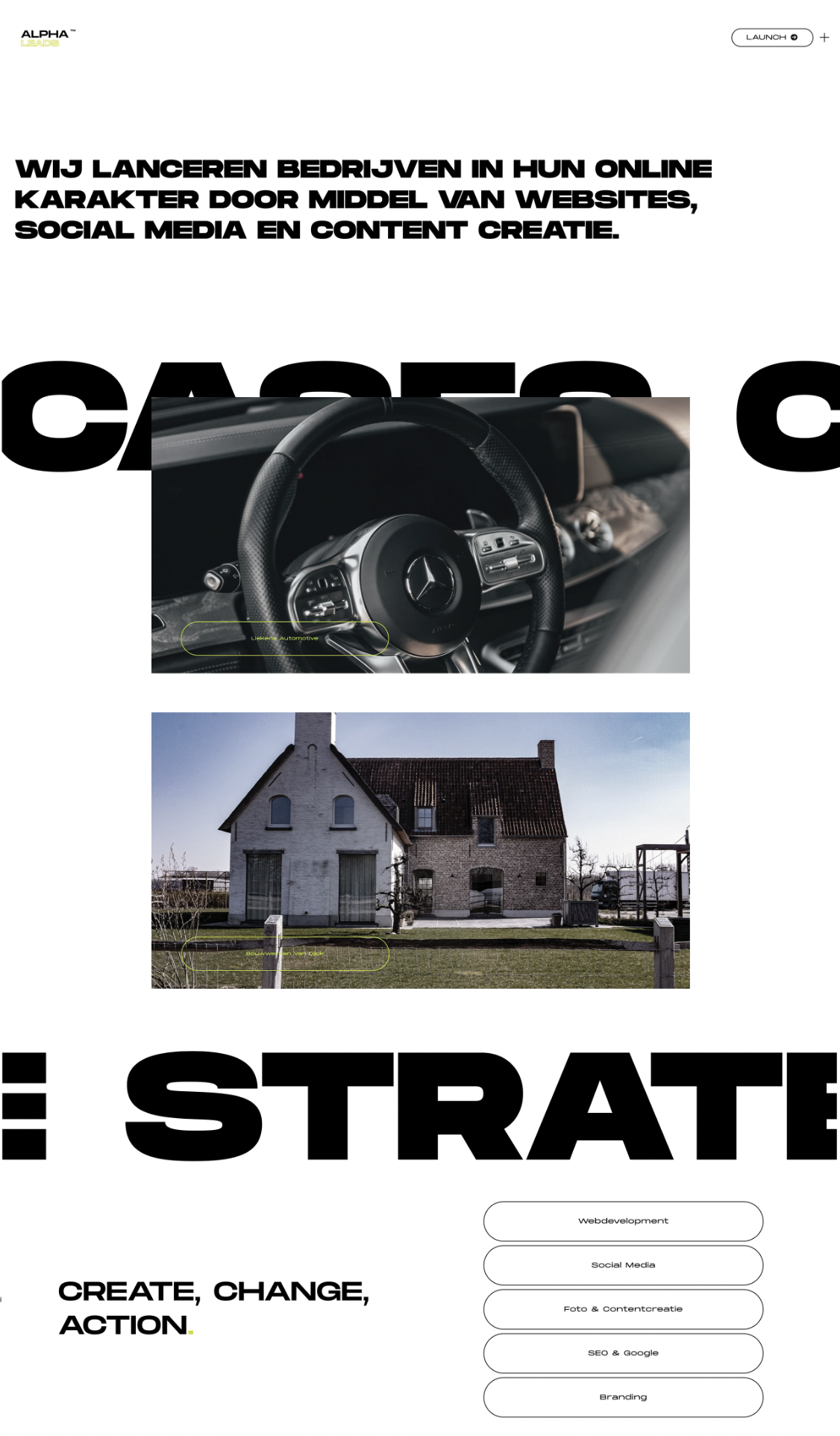
We did a rebranding for our own business and with that comes a new website. We went for a modern but simple layout without much graphic elements. The flair of the website comes with tools like sticky blocks and sections.
Dress Code
By SquareKicker
This site was built as a showcase for the SquareKicker Sticky features. It utilizes SquareKicker Sticky Blocks to capture the viewers attention and draw their attention to specific items as the page is scrolled.
Check out the tutorial to see how to add Sticky Block features to your next Squarespace build.
La Bonne Cave
By CATENAZZI GRAFIK+PRODUKTE
This website for a winebar showcases sticky split and sticky sections with a stunning black and white palette.
Mouse Cursors
By SquareKicker
This page was built out as an example of the new SquareKicker Mouse Cursor tool. Check out the tutorial to add some of these concepts to your next build.


