

Animated Button Hover Effects
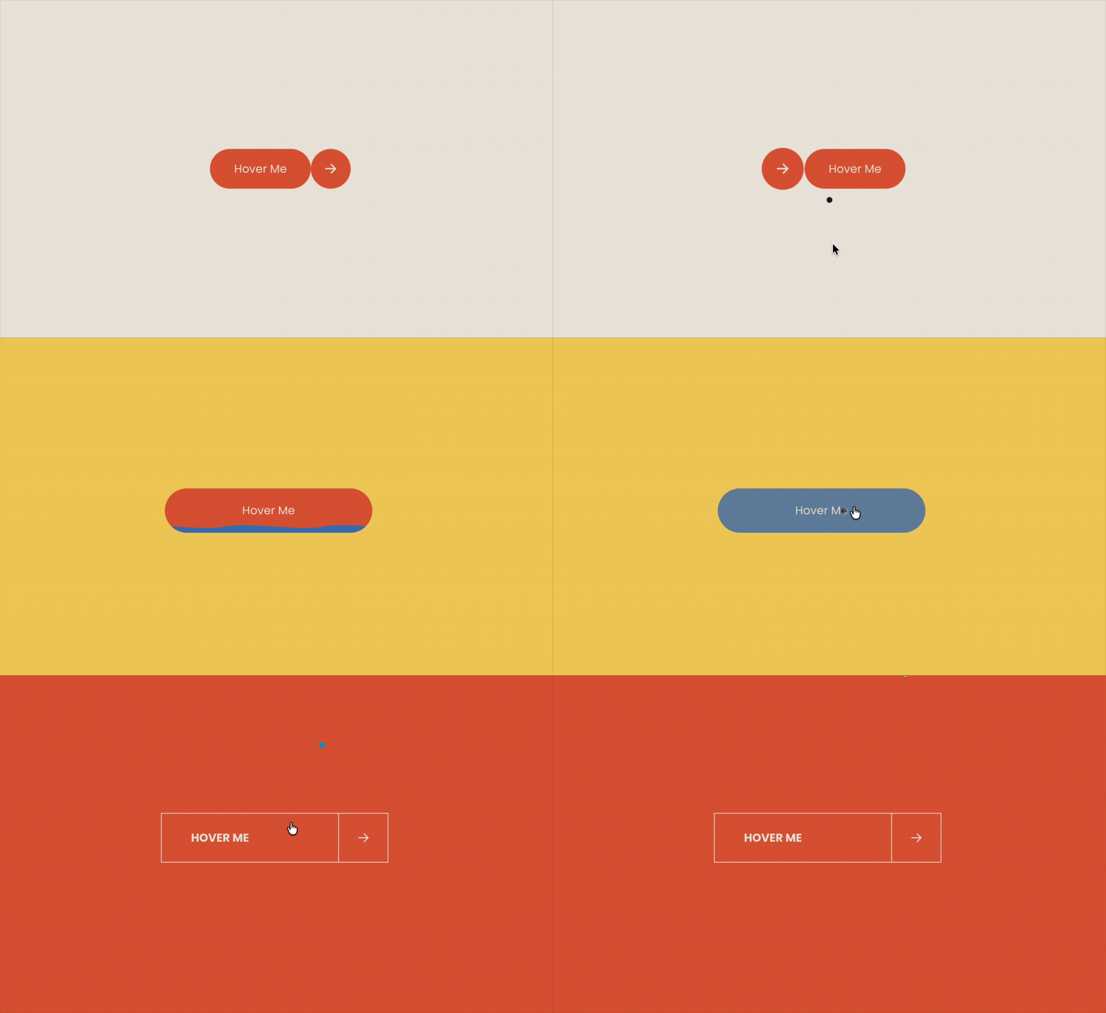
Make the small details part of your design. These three button styles, created with Compose, each respond differently on hover: an arrow switches sides, a wave of colour fills the button, and a dividing line bends as the cursor moves across it.
Use them as inspiration for your own calls to action, from playful booking buttons to understated portfolio links. Describe the look and movement you want to Compose, then preview and refine the result directly in Squarespace.
Button with circular arrow
On my Squarespace 7.1 button block, decorate the existing button link into a two-part CTA. Do not hardcode or replace the label: read the existing button text, trim it, put it inside a pill span, and append a circular span containing an inline right-arrow SVG. Preserve the existing link, href, attributes, focusability, and keyboard operation.Style the link as an inline flex row with gap: 0px. The pill and circle must be flush, with no connector or visible space. Remove the original link’s width, padding, margin, border, background, and shadow so the pill and circle provide all visual styling. Keep the container width automatic. Use Squarespace primary button tokens for the shared fill and text/arrow colour. Use a 56px circle, 34px horizontal pill padding, 42% arrow size, fully rounded corners, and let the CTA size itself from its existing label.Initial layout is [ existing button text ][ arrow circle ], with the pill on the left and circle on the right.Use one paused GSAP timeline, created once and reused. Before creating or refreshing it, measure the live pill width, circle width, and computed flex gap. Do not hardcode either movement distance.The timeline lasts exactly 0.62s and has these exact simultaneous stages:At 0.00s, animate the pill only from x: 0 to x: circleWidth + gap. Its duration is the full 0.62s; use ease: 'back.out(1.35)'. The pill moves right throughout the entire sequence and gets the subtle overshoot at the end.At 0.00s, animate the circle only from scale: 1 to scale: 0.10. Duration: exactly 0.279s (0.62 × 0.45). Ease: exactly power2.in. Keep its transform origin at center center. The SVG arrow stays inside the circle and squeezes with it; do not fade, swap, or animate the arrow separately.At exactly 0.279s, while the circle is still collapsed at scale: 0.10, perform an instantaneous position swap: set the circle’s x to -(pillWidth + gap). This is not an animated travel. It moves the tiny, nearly invisible circle from the right side to the left side behind the transition.Starting at exactly 0.279s, animate the circle from scale: 0.10 back to scale: 1. Duration: exactly 0.341s (0.62 × 0.55). Ease: exactly back.out(1.35). Do not animate its x during this reveal. The circle springs open on the left while the pill completes its rightward movement, leaving the final layout [ arrow circle ][ existing button text ] with the two shapes still flush.Do not add a separate arrow fade, arrow translation, circle travel tween, or elastic tail beyond back.out(1.35). The apparent circle movement comes only from collapsing it, instantly relocating it while tiny, and reopening it at the other side.On mouse leave and keyboard blur, reverse this same timeline. On mouse enter and keyboard focus, play it forward. Reuse the timeline rather than creating stacked timelines, reset and remeasure it on resize, and make rapid hover changes interruptible without leaving the CTA in a broken halfway state.Water Ripple Button
Make my button a pill-shaped "rising water" button.Structure and shape:Target the button link inside the block, position: relative, isolation: isolate, overflow: hidden so everything clips to the rounded shape.Fully round corners — border-radius: 999px.Roomier padding: 14px block, 28px inline.Kill the button's own background image so the water layer reads clean.The water:One water layer sitting behind the label (z-index below the text), fully opaque, colored with the theme's dark accent blue via hsla(var(--darkAccent-hsl), 1).It bleeds about 5px below the bottom of the button so the button's own background never peeks out under the waterline.Two-part mask on that single layer: a repeating wave tile across its top edge (a single-crest tile so you only get about two lazy waves across the button width) and a solid gradient block below it. Oversize the lower mask so there's no seam or gap at the bottom.Wave tile: about 14px crest height, 140px tile width.Motion:The crest strip scrolls sideways all the time, roughly 2.6s per loop, even at rest.At rest the water sits at a small level near the bottom — about 2px of visible waterline.On hover the water rises to fill the whole button over ~0.7s with cubic-bezier(0.22, 0.61, 0.36, 1). The crest's bottom offset animates up in lockstep with the fill height so the wave rides the surface as it rises, with a small overshoot so the crest clears the top edge on a full fill.Water stays fully opaque through the hover state — no fade, no transparency at any point.The label color never changes — no crossfade, no hover recolor. The blue does all the work.Reverse smoothly back to the resting level on mouse-out.Expose the key values (fill color, opacity, corner radius, padding, idle level, wave height, wave width, wave speed, rise duration, easing, bottom bleed) as CSS custom properties at the top so they're easy to change.Bow and Arrow Button
Build a liquid-line hover effect for a Squarespace 7.1 button.Dependency: GSAP 3 from CDN. Poll for window.gsap (up to 50 × 100ms) before initialising — the injected script can run before the library lands.Targeting
Resolve targets from a selector string. For each match: if it's an <a>, use it; otherwise querySelector('a.sqs-block-button-element') inside it. If the anchor isn't there yet, MutationObserver on childList/subtree until it appears. Then wait for data-initialized="true" on the anchor (attribute observer) before building — Squarespace rewrites button internals on boot and will nuke anything added early.DOM the effect builds
Never remove or rewrite the original <a> — href, target, click handling stay untouched. Mark it data-sk-liquid-arrow, then append three things and CSS-hide every pre-existing child via > :not([data-lq-cell]):not([data-lq-frame]) { display:none }:1. span[data-lq-cell="label"] — text copied from the original label.2. span[data-lq-cell="arrow"] — overflow:hidden, holds two identical arrow SVGs built in JS (M5 12H19 + M13 6L19 12L13 18), absolutely positioned.3. svg[data-lq-frame] — absolutely positioned overlay containing five <path> elements keyed top, bottom, left, divider, right, each with vector-effect="non-scaling-stroke" so strokes stay 1px regardless of viewBox scale.Layout
The anchor becomes inline-grid !important with grid-template-columns: minmax(max-content,1fr) var(--lq-cell) and grid-template-rows: var(--lq-cell). Kill the native button look with !important: no background, border, radius, shadow, padding — and repeat that on :hover/:focus so Squarespace's own hover styles can't leak through.The measurement pass (this is the bit that usually gets missed)
The arrow cell must be a perfect square matching the label's natural height. But the label has min-height: var(--lq-cell) — so measuring it directly feeds back on itself and the button grows a few px every resize. Fix: set data-lq-measuring on the anchor, which flips grid-template-rows to auto and the label's min-height to 0, read label.getBoundingClientRect().height, remove the attribute. Round to 2dp, write it as inline --lq-cell.Then read geometry into one object: anchor width/height, divider x (label.right - anchor.left), cell size, arrow width. Set the frame's viewBox/width/height to the anchor box so SVG units equal CSS px. Centre both arrows with a small optical nudge on the x.Motion state
One plain object { left, divider, right, arrow } — GSAP tweens the numbers, a single draw() reads them and rewrites all five path d strings plus both arrow transforms. Nothing else touches the DOM.- draw() builds each vertical edge as a cubic: M x 0 C x+o h*0.3, x+o h*0.7, x h where o = amount * bend. Left edge uses -state.left so it bulges outward. Top and bottom stay straight, inset 0.5px for crisp strokes.- Arrow A sits at state.arrow cellSize, arrow B at (state.arrow - 1) cellSize. So at 0 the first arrow is centred and the second waits offscreen left; at 1 they've swapped. Continuous, no snapping.Timelines — never reverse anything- Arrow: its own gsap.to(state, {arrow: active ? 1 : 0, duration, ease:'power3.inOut', overwrite:'auto'}). Always heads to where it should currently be, so leaving mid-flight just retargets.- Wave: a separate timeline, killed and rebuilt fresh each time. Takes a direction +1 on enter, -1 on leave — mirrored inward, not reversed. Left edge flexes first (power2.out, ~0.36× duration), then returns on elastic.out(1, 0.42) over ~1.6× duration. Divider and right edge repeat that pattern offset by ~0.18× and ~0.36× duration. The elastic ring-out deliberately outlasts the arrow slide — that's what makes it read liquid instead of snappy.Why reversing breaks it: reverse() plays the elastic settle backwards, so leaving after it's finished means the arrow sits frozen for ~0.7s while edges un-wobble, but leaving early moves it immediately. Inconsistent by design.Hover/focus
Track hover and focus as separate booleans, derive one active = hover || focus. Bail early in sync() if active hasn't changed — clicking fires focus on top of mouseenter and would otherwise double-fire the wave.When mouse out don’t do any animationRe-measuring
ResizeObserver on both anchor and label, plus document.fonts.ready. If gsap.isTweening(state) when a measure comes in, set a pending flag and return — flush it from the onComplete of whichever tween finishes. Never re-measure mid-wave or the geometry jumps.Reduced motion
Check prefers-reduced-motion. Skip the wave entirely and set arrow duration to 0.Teardown
Stash a teardown fn on a global under a unique key and call any prior one first, so re-injection is safe. It clears timers, disconnects all observers, kills the wave and killTweensOf(state), removes all four listeners, removes the three appended nodes, and strips data-sk-liquid-arrow, data-lq-measuring and the inline --lq-cell.Expose as variables: target selector, arrow duration, bend amount, optical nudge, stroke colour + width, text colour, label min-width, padding block/inline, arrow size, arrow stroke weight.Typography (label cell)- Expose the lot as variables: --lq-font-family, --lq-font-size, --lq-font-weight, --lq-letter-spacing, --lq-text-transform, --lq-line-height. Default to inherit so the Squarespace button style still shows through unless overridden.- Apply them on [data-lq-cell="label"] with !important — Squarespace's own button rules are specific enough to win otherwise, and they'll re-apply on :hover/:focus too, so repeat there.- Label cell is display:flex; align-items:center; justify-content:center with min-width: var(--lq-label-min-width) and padding: var(--lq-pad-block) var(--lq-pad-inline).- Important caveat to state explicitly: the measurement pass depends on font metrics. If a webfont swaps in after first paint the label height changes and the square cell is suddenly wrong. That's exactly why document.fonts.ready triggers a re-measure — worth saying out loud in the prompt so a model doesn't drop it as housekeeping.- The text should be uppercase and align to the leftArrow placement- Arrow cell is the second grid column: square (var(--lq-cell) both ways), position:relative, overflow:hidden, display:block.- Both arrow SVGs are position:absolute; top:50%; left:50% at var(--lq-arrow-size) square, stroke:currentColor, stroke-width: var(--lq-arrow-stroke), fill:none, round caps and joins.- GSAP writes the transform, not CSS: translate(-50% + state.arrow*cellSize + nudgeX, -50% + nudgeY). Arrow A at state.arrow cellSize, arrow B at (state.arrow - 1) cellSize.--lq-arrow-nudge-x exists because the arrowhead's visual mass sits right of the geometric centre — usually about -1px to make it look centred.--lq-arrow-nudge-y exists because the arrow should optically centre against the label's cap height, not the full line box. With most fonts that's a hair above true centre.Note: Not all generations will be identical and may require additional prompts.
