Dynamic Mega Menus
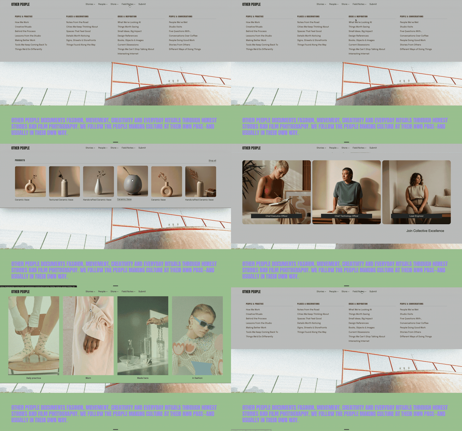
Create dynamic mega menus that pull in content from other pages, product collections, or sections across your Squarespace site. Use them to build richer navigation experiences with live content, images, links, categories, and product information that stays connected to the rest of your site.
Use Compose to describe what you want to pull into your Mega Menu.
Option 1 Setup: Drop down links with images
Add a Dropdown Folder to to your Main Navigation of your site.
Add Links to your Dropdown folder.
Add Images from your asset Library with Compose’s context “+”
Use the below prompt and also describe which image goes with which link.
Starting Prompt
Use the items in this dropdown as items in a center aligned new mega menu. Hide the existing dropdown and remove the nav background color. Each item in the nav dropdown should create a grid of columns. 4 columns, vertically aligned. Each item should have a thumbnail that goes with the item link. Create a zoom hover on the image, and fade slightly the other creating a focus on the item hovered on. add the titles grouped thumbnail together. Thumbnail above the titles. Below are the title that should align with the correct image.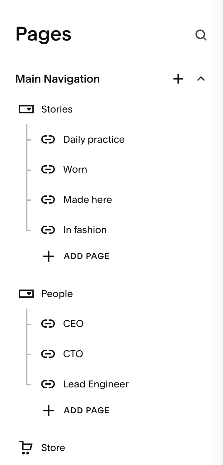
Option 2 Setup: Pull in Section from another page
Add a hidden page with the url /mega-menu
Add a section to your page that you want to be your mega menu
Add this section as context to your Compose prompt.
Add the Folder to your navigation as context to your Compose prompt.
Give your URL mega menu url slug
Give you other links to the drop down folder, these will be used on mobile overlay menu.
Create the prompt while on the /mega-menu page.
Use the starting prompt below, and change what you would like.
Starting Prompt
Build a mega menu for the links in the header nav that contain  href="/mega-menu"), pulling live content from the page /mega-menu.
Prefetch /mega-menu on page load, parse once, cache the result. Get the section and use this content as the mega menu and replace the dropdown with this section. Slide it down when hovering on the link.
If that response has no usable section, retry /mega-menu?format=main-content.
Ignore anything inside #header or the footer.
Fallbacks in order: the section's data-section-id, then the first .page-section in the document.
Append the panel to body, not inside #header, so header CSS can't bleed in or swallow clicks. Pin it flush to the bottom edge of the header and keep it pinned on scroll/resize.
The cloned section is the entire visible surface — no padding, gutters or white edges around it. Its own section background should reach every edge.
Slide down from behind the header on hover of the nav item, slide up on hover off. Small close delay so moving the mouse from link to panel doesn't kill it.
Only hide the native folder dropdown once a section is genuinely in the panel. If the fetch fails, leave native behaviour completely alone.
The nav link button navigates to its data-href on click, since the native dropdown is gone.
Styling on other pages keep the same, font, colors, etc.
Copy every inline <style> from the fetched page into the panel, deduped.
Add any <link rel="stylesheet"> the current page doesn't already have.
Rewrite #collection-<id> rules to a class on the panel so page-scoped CSS still matches off-page.
Carry the fetched <html> and <body> inline custom properties onto the panel so tweak variables resolve.
Notes: Desktop only, leave the mobile nav alone.
Adopted CSS isn't sandboxed, so a very global page rule could leak — keep both adoption steps behind flags that can be switched off.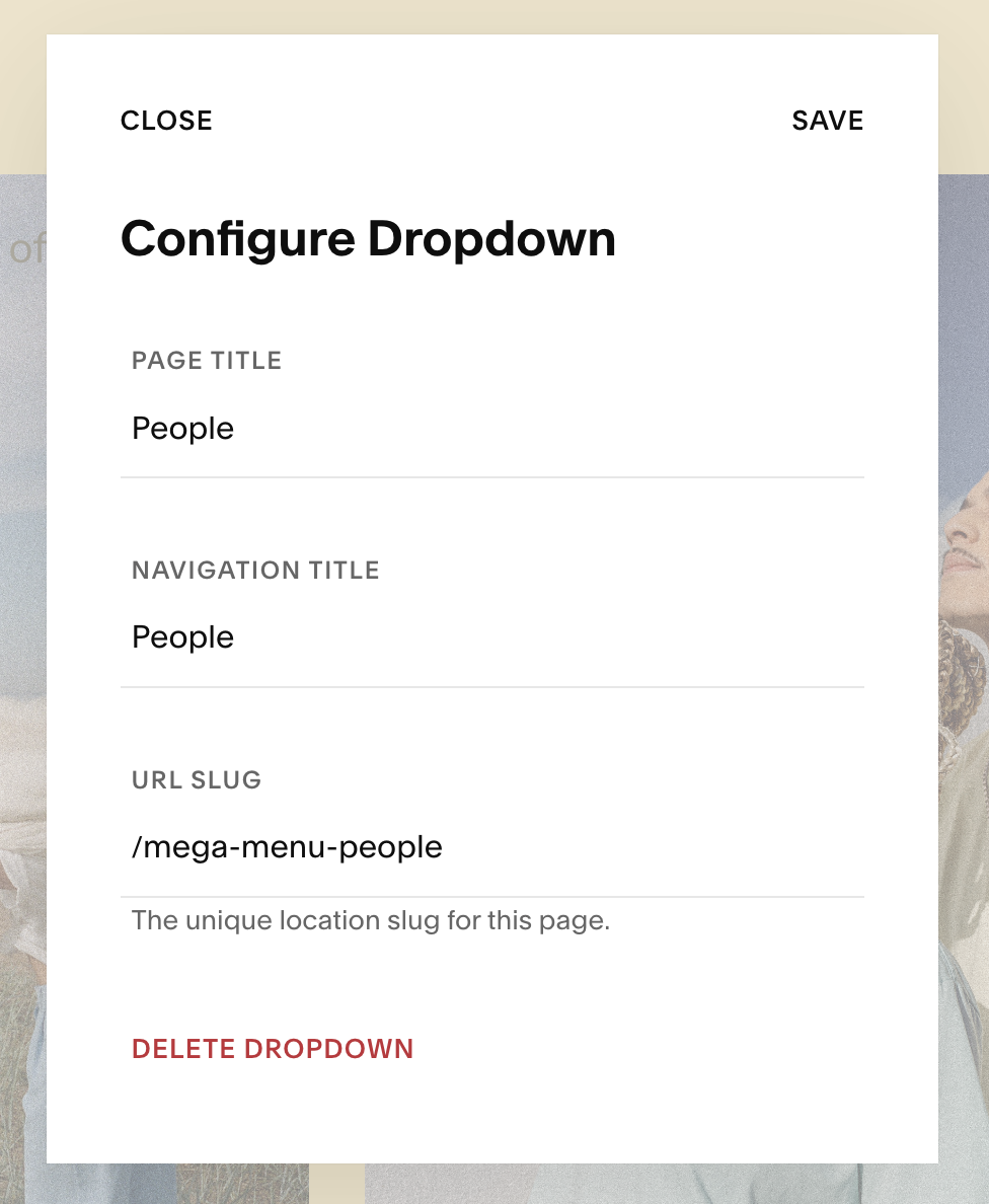
Option 3 Setup: Dynamic Store Products
Create a Store.
Make sure there are products in the store with images and titles.
Use Compose to select the Store in the nav
Use the starting prompt below.
Starting Prompt
I want to build a dynamic mega menu based off the product on my site.  Fetch all product from this link,  get the product, make beautiful modern mega menu that slides down.  Add a down cheveron to the right of store. when I hover on store, slide down a mega menu and slide up when not on the mega menu or link.
The links should be dynamically pulled on page load from the store.  Make list of links for each product and put them in columns in a grid and make them responsive.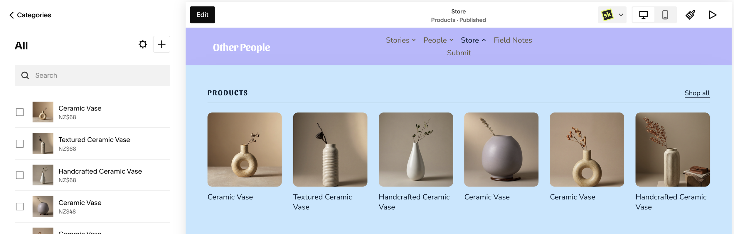
Note: Not all generations will be identical and may require additional prompts.
Option 4 Setup: Dynamic Columns with Text
This prompt will create a list of links in columns from a dropdown link. Also it will create a mobile accordion.
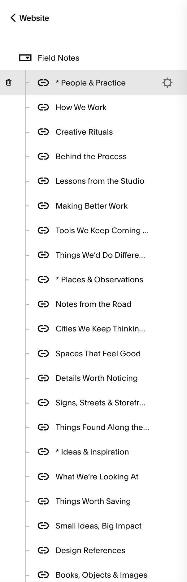
Create a dropdown link
Create links in dropdown
For each heading, create a link title starting the a (*) for example: (* Other People)
Each heading creates a new column.
Starting Prompt
I want to convert the existing dropdown navigation under Field Notes into a full-width mega menu on desktop, and a nested accordion structure inside the mobile overlay menu.
Use the existing links inside the Field Notes dropdown as the source of truth. Do not manually recreate or duplicate the navigation links.
Keep all headings and links in their existing order.
When a user hovers over Field Notes in the main desktop navigation:
Replace the normal dropdown with a full-width mega menu.
The mega menu should slide down smoothly from beneath the header.
Keep the mega menu open while the user is hovering over either the Field Notes navigation link or anywhere inside the mega menu.
When the user moves their cursor away from both the Field Notes link and the mega menu, smoothly slide the mega menu back up and close it.
Avoid flickering or accidentally closing the menu while moving the cursor between the navigation link and the mega menu.
Build the mega menu dynamically from the existing Field Notes dropdown links.
Any dropdown item whose text begins with an * should become a column heading rather than a clickable navigation link.
For example:
*People & Practice
should display as:
People & Practice
All links following that heading should appear underneath it until the next * heading is reached.
Create one column for each heading found in the dropdown.
Distribute the columns evenly across the available width of the mega menu based on however many headings exist. The layout should adapt automatically if headings or links are added, removed, or reordered in the original dropdown.
Remove the * character from all displayed headings.
The desktop mega menu should:
span the full available width beneath the site header
align cleanly with the website layout
use the site's existing typography, colours, and navigation styling where possible
have comfortable spacing between headings and links
feel minimal, polished, and editorial
include subtle hover states on the navigation links
preserve the exact original order of all headings and links
not affect the existing mobile navigation behaviour
For the mobile overlay menu, use the same Field Notes dropdown structure to create nested accordions.
When the user taps Field Notes:
expand Field Notes downward inside the existing mobile overlay menu
show each * item as an accordion heading, without the *
keep the headings in their original order
make each heading independently expandable and collapsible
place all links that follow each heading inside that heading's accordion, stopping at the next * heading
preserve the original order of the links inside each accordion
use smooth open and close animations
clearly indicate which accordion is open with a subtle chevron or similar indicator
do not navigate when tapping a heading created from a * item
ensure normal links remain clickable and behave as standard navigation links
The hierarchy on mobile should be:
Field Notes
→ Heading
→ Links under that heading
For example:
Field Notes
→ People & Practice
 → How We Work
 → Creative Rituals
 → Behind the Process
→ Places & Observations
 → Notes from the Road
 → Spaces That Feel Good
 → Details Worth Noticing
Do not change the underlying Field Notes navigation structure. Both the desktop mega menu and mobile accordions should be generated dynamically from the existing dropdown so future changes to those navigation links are reflected automatically.