

Expanding Split-Screen Overlay Menu
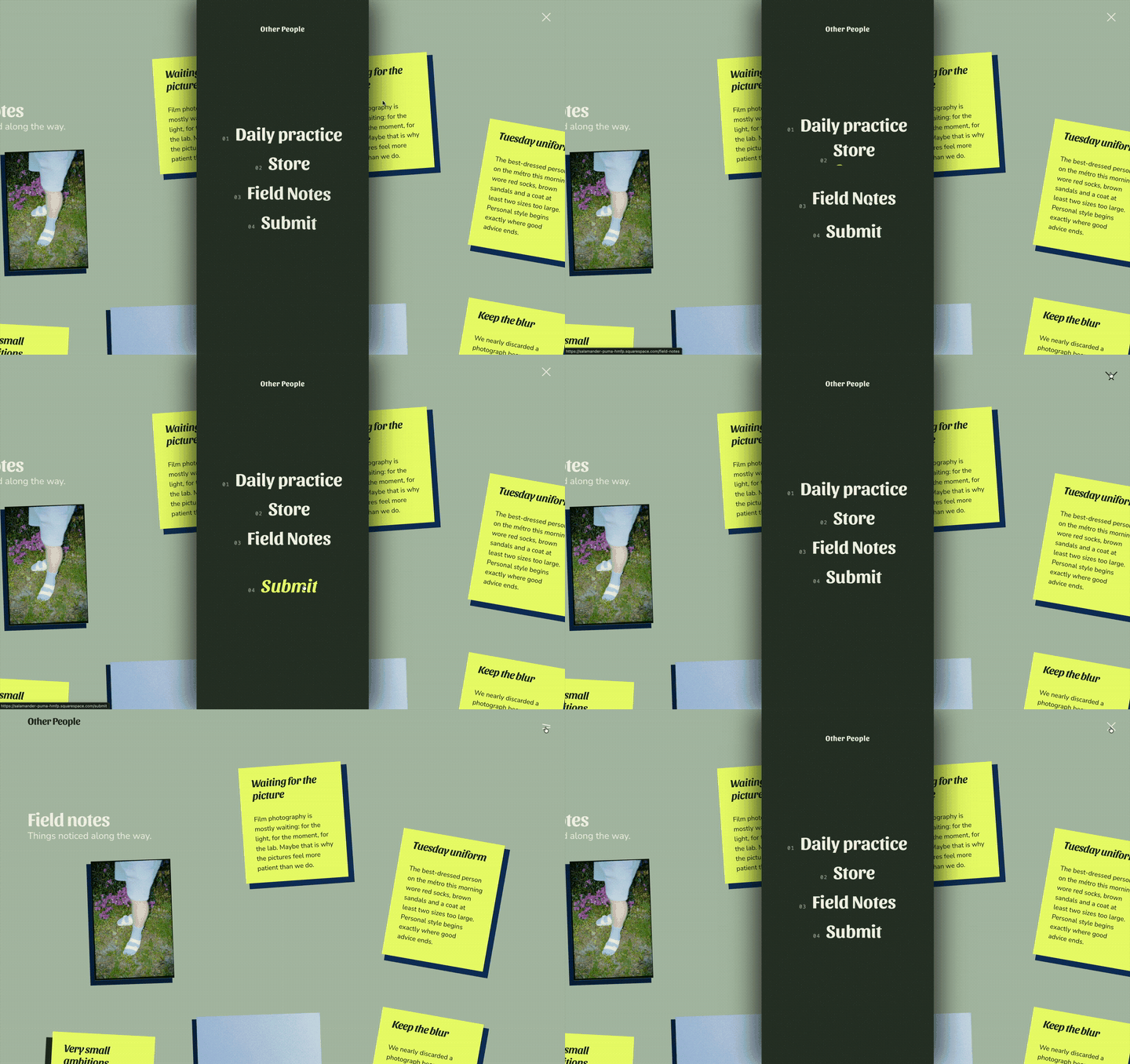
This expanding split-screen overlay menu replaces the standard desktop navigation with a full-height animated menu that opens from the centre of the screen.
When triggered, the navigation expands into a vertical panel while the current page remains visible on either side. Large stacked links, numbering and custom typography give it a more editorial, high-end feel than a traditional dropdown or hamburger menu.
It was built by starting with a normal Squarespace navigation and adding the required links to Main Navigation. From there, the header was selected with Compose and transformed into the expanding overlay design.
Because it still uses the existing Squarespace navigation structure, the links can continue to be managed normally in Squarespace, while Compose handles the custom layout, styling, animation and interaction.
Starting Prompt:
I want to try create completely different overlay menu for desktop. On click on the hamburger, open a narrow menu that opens in the center of the screen, full height, but it looks like is cuts the website in half and push the website apart, pushing each half to their respective sides. As the menu expands from the center. When I hover on a navigation item, I want the ones that are above and below to be pushed away from the one I’m hovering on, so that it’s creating space above and below the one that I’m hovering on. Add any animation that you think would look great for an editorial feel. Keep the close button in the same spot as the hamburger menu for good UX.