

Lightboxes are a great way to reveal more content on your Squarespace website without taking visitors away from the page they're viewing.
With SquareKicker Lightbox, you can turn regular Squarespace links into interactive overlays that display videos, images, internal pages, and external content. You can also customize how each lightbox looks, where it appears, and how it enters the screen.
In this guide, you'll learn how to set up and style lightboxes, then use them to create video popups, slide-in drawers, newsletter forms, and interactive image hotspots.
1. How to create a lightbox in Squarespace
The starting point for every lightbox is a regular Squarespace link.
You can enable SquareKicker Lightbox anywhere you can add a link, including buttons, images, text, navigation, and other linked content.
Step-by-step: Enable lightbox on a link
Open your Squarespace editor and select the element you want to link.
Edit the link and choose your destination. This could be an internal page, external website, image URL, or video.
Enable the Lightbox toggle in the link settings.
Save your changes and test the link.
Instead of navigating away from the current page, your linked content will open inside a lightbox overlay.
That's the basic setup! Next, you can customize the appearance to suit your site's design.
2. Customize your lightbox settings
SquareKicker gives you sitewide styling controls for your lightboxes.
To find them, open the SquareKicker Extension and navigate to:
Site → Advanced → Lightbox Settings
You'll see three Lightbox types:
Internal: For pages within your Squarespace website.
External: For external websites and direct image URLs.
Video: For linked video content.
Each type has its own global settings. This means you can create different styles for different content types while keeping the design consistent across your site.
For example, you might use a wide, centered lightbox for videos and a narrow, slide-in drawer for internal pages.
Preview your changes
Select the lightbox type you want to customize and enable Show Preview.
For internal lightboxes, you can also choose which page to preview. This is especially helpful when styling content such as forms or staff profiles.
Tip: The preview helps you style your lightbox, but it doesn't activate one. You'll still need to enable the Lightbox toggle on the individual link.
Adjust the appearance
Within Lightbox Settings, you can customize:
Backdrop: Change the background color, transparency, and blur behind your lightbox.
Corners and shadow: Adjust rounded corners and add depth.
Dimensions and aspect ratio: Choose a preset ratio, set a custom ratio, or use Fill to occupy the available viewport.
Position: Move your lightbox horizontally or vertically within the screen.
Entry animation: Choose fade or slide in from the top, bottom, left, or right.
Close button: Adjust its position, icon color, size, and background.
The close button can sit inside the lightbox or outside it on the backdrop. You can also hide it.
If you're using Fill, keep the close button inside the lightbox so it remains accessible.
Visitors can also close a lightbox by clicking the backdrop or pressing Escape.
Once you're happy with the preview, test a live lightbox link on your page.
3. Create a video lightbox
Video lightboxes are useful when you want to share a tutorial, showcase, or other video content without sending visitors to another page.
Step-by-step: Add a video popup
Add a Squarespace button or select an existing linked element.
Link it to your video.
Enable the Lightbox toggle.
Open Site → Advanced → Lightbox Settings.
Select Video and enable Show Preview.
Customize the backdrop, dimensions, position, and close button.
Save your changes and test the video link.
You can use the aspect ratio controls to suit different video formats.
For example, a standard horizontal video might use a wider lightbox, while a YouTube Short could use a custom vertical aspect ratio.
Because Video Lightbox settings are global, other video links with Lightbox enabled will use the same styling.
4. Create a slide-in drawer for internal pages
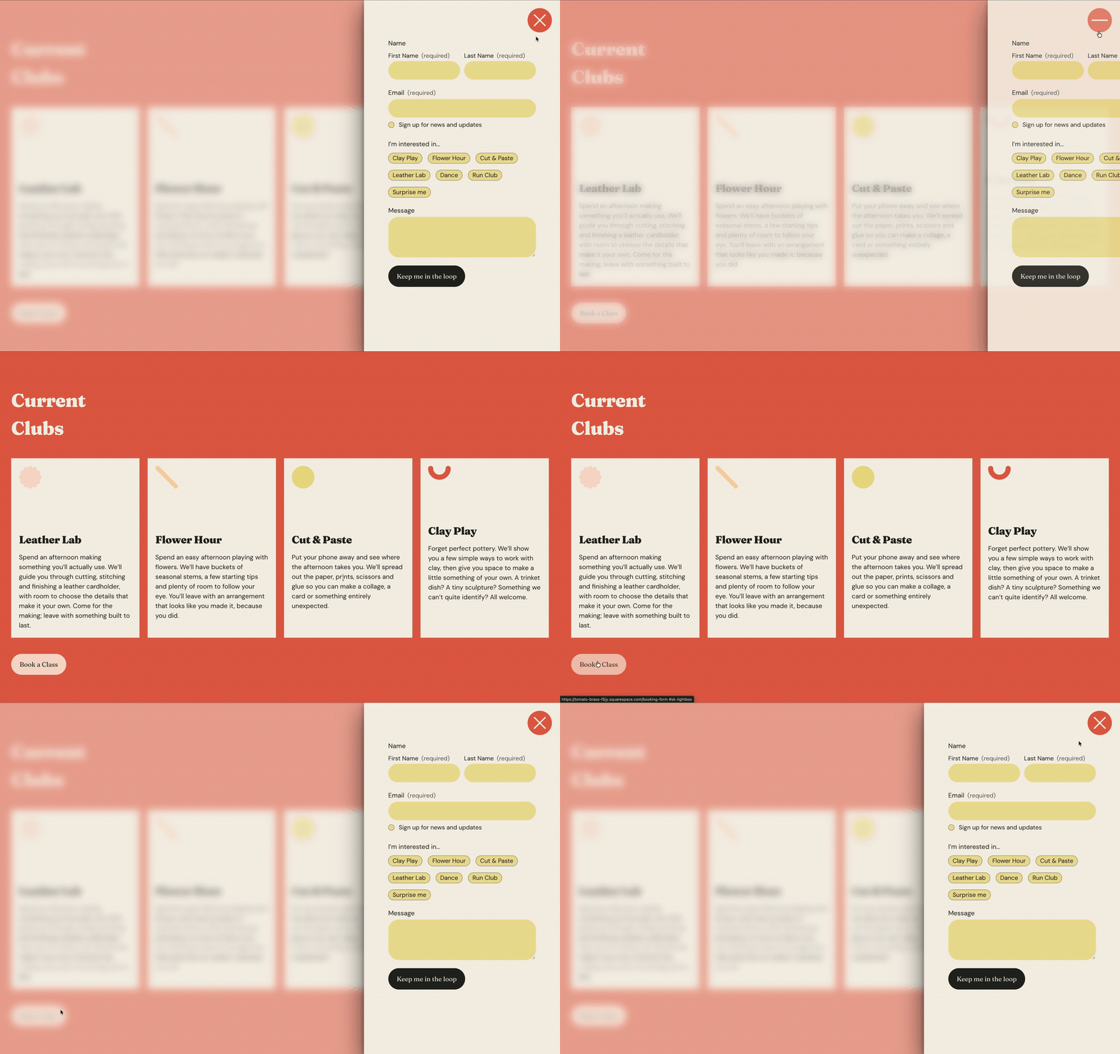
A slide-in drawer is a useful way to display additional information while keeping visitors on the page they're browsing.
For example, you could create a staff directory where clicking someone's profile opens their details in a drawer on the right side of the screen.
Step-by-step: Create a slide-in drawer
Create the internal Squarespace page you want to display, such as an individual staff profile.
Link a button, image, or other element to that page.
Enable the Lightbox toggle on the link.
Navigate to Site → Advanced → Lightbox Settings.
Select Internal and enable Show Preview.
Set a narrow width and position the Lightbox on the right side of the screen.
Choose the Slide Left entry animation.
Preview and test your drawer.
When someone clicks the linked element, the internal page slides into view.
The page's header and footer won't appear inside the Lightbox, keeping the focus on the content.
Design tip: Since the drawer uses a narrower layout, design your internal page with those proportions in mind. Switching to the Squarespace mobile view while designing can help you create content that fits comfortably within the drawer.
Using Lightbox with auto layouts
You can also enable Lightbox links on individual items within a Squarespace auto layout.
Open the section's content settings.
Select Edit Content, then Content.
Choose the individual item you want to edit.
Scroll to its link settings and click Edit.
Enable Lightbox.
This works particularly well for staff directories where each item links to a separate profile page.
5. Create a newsletter or contact form popup
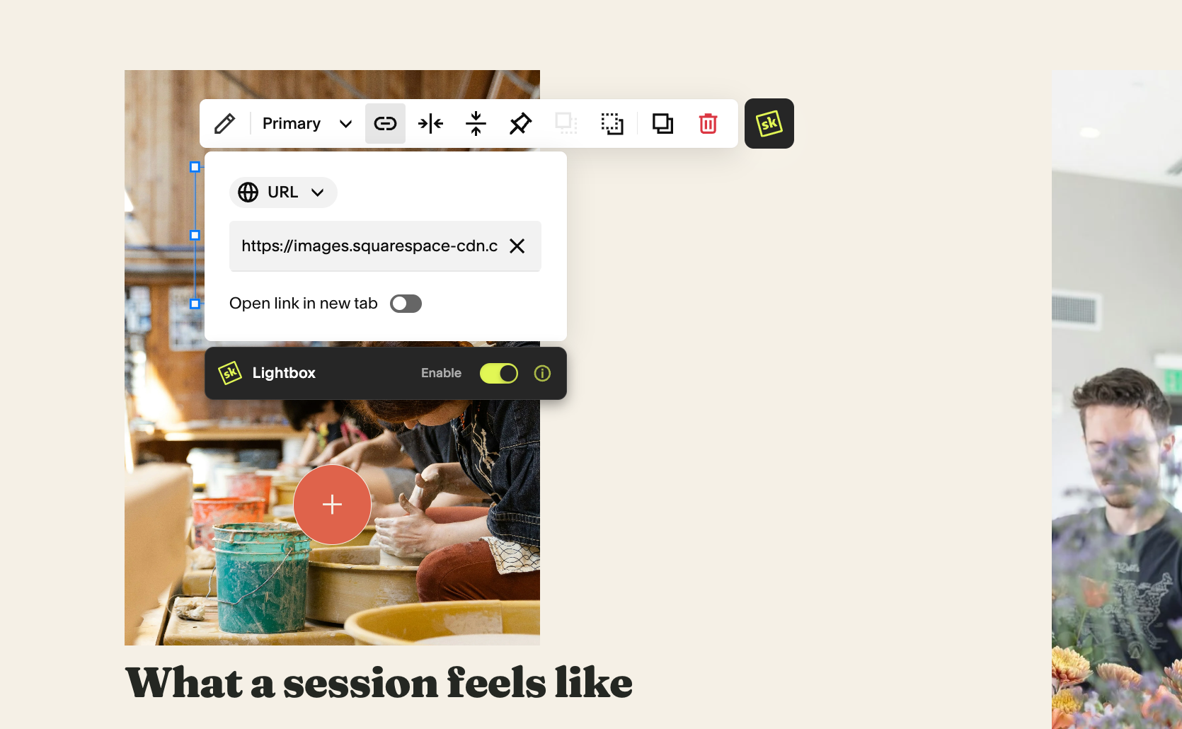
Lightboxes can also display forms from internal Squarespace pages.
Rather than placing a form directly within your main page layout, you can reveal it when someone clicks a button.
Step-by-step: Create a form popup
Create an internal Squarespace page containing your form.
Add a button to the page where you want visitors to access the form.
Link the button to your form page.
Enable the Lightbox toggle.
Open Lightbox Settings → Internal.
Select your form page in the preview.
Adjust the dimensions, position, and entry animation to suit your design.
You could create a centered form popup, position it at the top of the screen with a slide-down animation, or place a smaller form in the bottom-right corner.
Experiment with the position, dimensions, and entry animation together to create a layout that feels considered within your site.
Keep in mind: Internal Lightbox settings are global, so changes to your form popup styling will also affect other internal lightboxes on the site.
6. Create interactive image hotspots
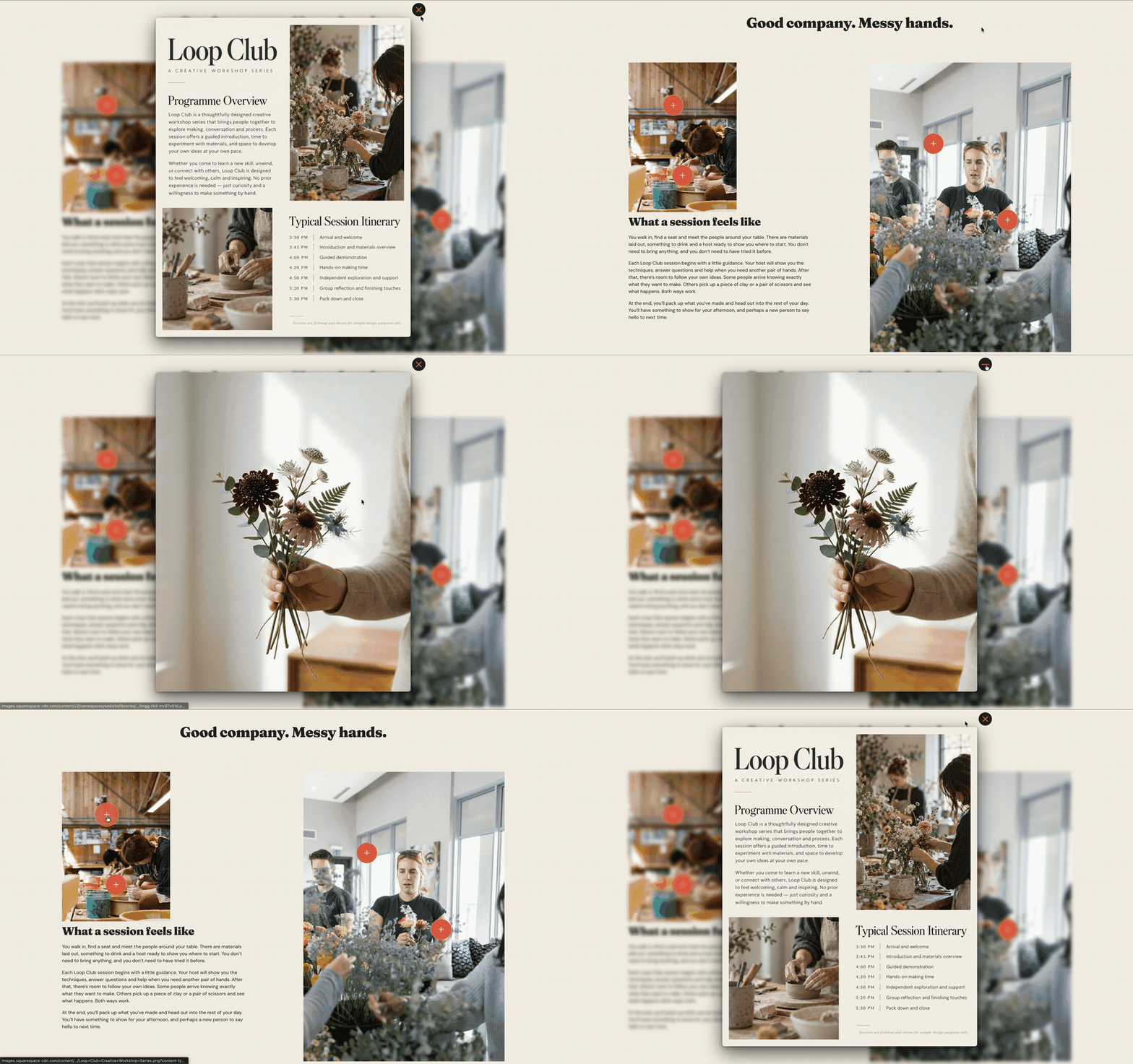
Image hotspots let visitors explore specific details within an image.
For example, you can place small circular buttons over different parts of an image. When someone clicks a hotspot, a larger image or detail opens in a lightbox.
You can build these using regular Squarespace buttons and SquareKicker styling tools.
Step 1: Create your hotspot button
Add a Squarespace button over your image.
Change the button text to a single + symbol.
Under the button's Design settings, select Fit.
Position the button over the part of the image you want to make interactive.
Using a single plus symbol with Fit selected creates a compact button that works well as a hotspot.
Step 2: Style your hotspot
Use SquareKicker to customize the button's appearance.
You can adjust the color, border, and hover effects to match your website design.
If you're creating several hotspots, save the first button's styling as a SquareKicker Preset. You can then apply the same Preset to the remaining buttons for a consistent look without styling each one individually.
Step 3: Get your image URL
Next, you'll need the direct URL of the image you want to display.
Open the Squarespace Asset library.
Find and select your image.
Open File Details.
Right-click the image and choose Copy Image Address.
You now have the direct image URL for your hotspot.
Step 4: Connect the image to your hotspot
Return to your hotspot button.
Edit the button's link.
Paste in the image URL you copied.
Enable the Lightbox toggle.
Save and test the button.
Clicking the hotspot will now open your image in a lightbox.
Repeat this process for each hotspot, using a different image URL wherever you want to reveal another detail.
Step 5: Style your image Lightbox
Direct image URLs from your Squarespace Asset library use the External Lightbox settings.
Navigate to:
Site → Advanced → Lightbox Settings → External
From here, you can adjust the backdrop, shadow, aspect ratio, and close button.
For example, adding a subtle backdrop blur and shadow can help the image stand out from the page behind it. You can also match the close button colors to your hotspot styling for a more cohesive result.

Bring more content into your Squarespace pages
Lightboxes give you more flexibility in how visitors explore content on your Squarespace website.
Whether you're creating a video overlay, a slide-in staff profile, a form popup, or interactive image hotspots, the process starts with a simple link.
Once you've enabled SquareKicker Lightbox and set up your global styling, you can use the same approach across your site to create more considered, interactive browsing experiences.
Explore SquareKicker Lightbox on your next Squarespace project and see how you can bring additional content into the page without interrupting the visitor's browsing experience.
