

Custom Variants Product Page Layout
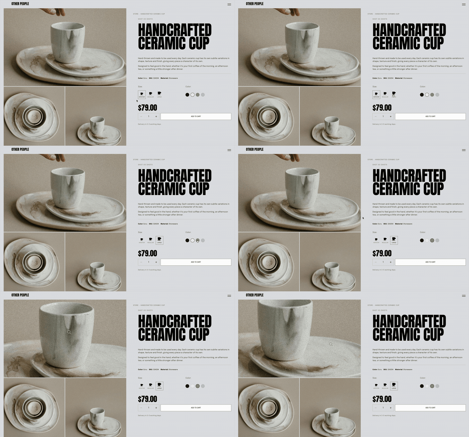
Turn the standard Squarespace product page into a completely custom shopping experience.
This design reworks the native product layout into an editorial-style product page with a large image gallery, sticky purchase panel, oversized typography and custom variant selectors.
Instead of replacing Squarespace Commerce, the design works with your existing Squarespace product, variants, pricing and Add to Cart functionality while changing how the product is presented to the customer.
The result is a product page that feels much more like a bespoke ecommerce experience while continuing to use Squarespace for the underlying store.
Before & After
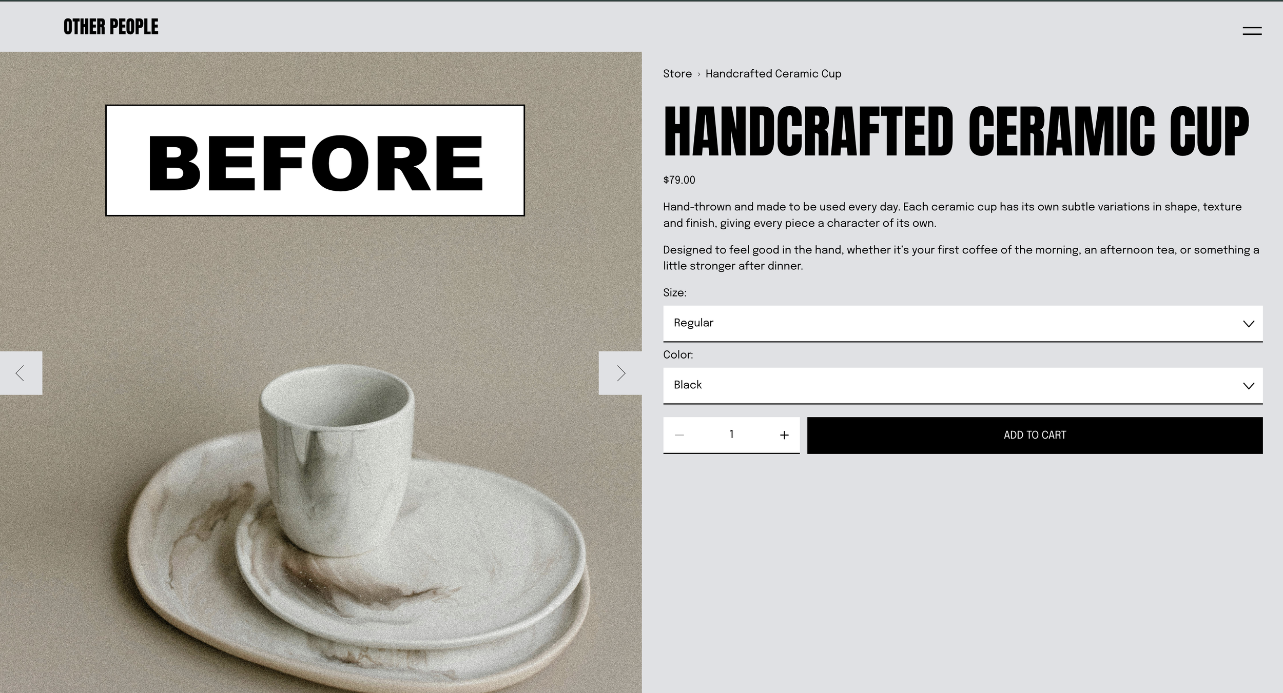
Before: The original Squarespace product page
Use a standard product gallery, product information layout and native dropdown selectors for product variants.
It works, but the design and interactions are largely determined by the template.
After: Using Compose
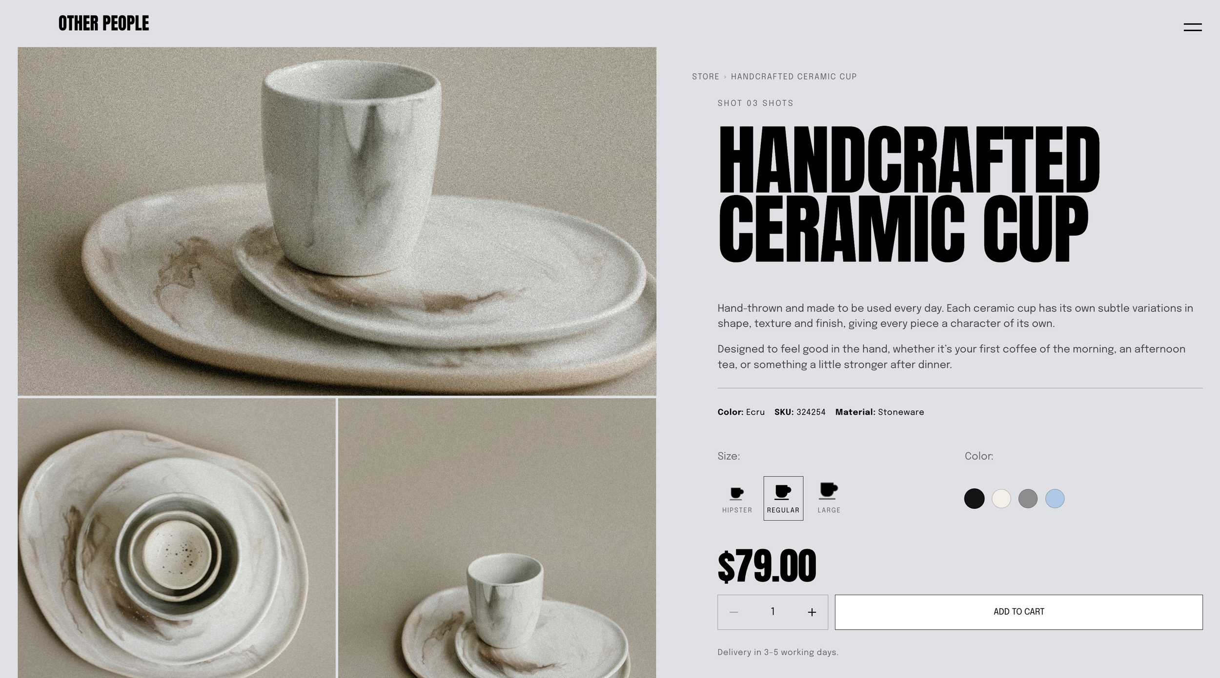
The same product is transformed into a two-column editorial layout.
The gallery becomes a large visual canvas with a hero image and supporting product photography. The product information stays visible in a sticky panel while the customer scrolls through the images.
Product variants are also redesigned. Colour options become visual swatches, while sizes use custom icon selectors rather than standard dropdown menus.
The gallery adds an interactive cursor zoom, allowing customers to inspect product photography directly as they move across an image.
How it works
Squarespace continues to control the important commerce functionality, including:
product information
pricing
product images
variants
availability
quantity
Add to Cart
Compose then changes the presentation and interaction layer around that content.
The native image gallery is reorganised into a custom editorial grid, the product information becomes a sticky buy panel, and the existing product variants are turned into custom visual controls.
Because the design still uses the existing Squarespace product data, customers are selecting real product variants rather than interacting with decorative controls.
Product Gallery
The standard slideshow is replaced with a static editorial image layout.
The primary product image appears as the large hero image, with additional product photography arranged underneath it.
A custom image zoom interaction follows the customer's cursor across the photography, giving the gallery a more tactile ecommerce feel.
Related product imagery can also switch to an alternate image on hover.
Custom Product Variants
Native variant dropdowns are transformed into visual controls.
Colour variants can become circular swatches, making available colours immediately visible.
Size options can use custom icons that visually increase in scale between sizes.
The controls remain connected to the underlying Squarespace product variants, so customers are still selecting the actual option used when the product is added to their cart.
How to Set It Up
Start with a normal product inside your Squarespace Store.
Add your product title, description, price and product photography as you normally would.
Then add the variants you want customers to select. For example:
Size
- Small
- Regular
- Large
Colour
- Black
- Cream
- Sage
- Grey
Compose can then use those existing product options when creating the custom selectors
TIP: You could include the #hex color in your prompt if you really want to customise what “Cream” color is rendered for example, and then use Compose’s Controls to customise the color after the prompt as well. ie Cream = #FFFDD0
For other variants such as size, finish or format, you can ask Compose to replace the standard dropdown with icons, buttons or another visual selector.
TIP: You could also upload your size images as PNG’s to your asset library to use in your variant designs.
Once the product content and variants are in place, open Compose on the product page and use the starting prompt below.
Tip: You can also download the above image and use as a reference image.
Starting Prompt:
Reimagine my product detail page as an editorial spread. Full-bleed section, cream background with hairline vertical column rules running the full height behind everything,  like a print grid showing through.
Layout: Two columns. Left is the gallery, right is the buy panel, and the panel stays sticky while the images scroll past it. Kill the native slideshow — lay the shots out as a static grid instead, hero image full-width across the top, the rest tiling underneath it.
Type: Oversized condensed display face for the product title, Anton or similar, pushed much larger than normal with tight tracking, but capped so it never overflows its column. Price sits directly underneath it in the same family. Keep the description smaller and quieter with a narrow measure so there is strong contrast between the typography.
Palette: Cream paper with sage green accents and ink.
Interactions: Add cursor zoom to the gallery images. The image should scale underneath the pointer and track its position. Use a custom sage SVG magnifier cursor with the hotspot centred on the lens. Related products at the bottom should swap to their second image on hover.
Variant pickers: Replace the native dropdowns. Turn colour variants into round swatch buttons. Turn size variants into custom icon selectors that progressively increase in size.
Make the palette, typography scale, grid columns, gutters, image ratios, zoom amount and cursor styling adjustable.
Note: Not all generations will be identical and may require additional prompts.
